v1.0.1Claude Projects don’t accept SVG uploads, so the original instructions failed at rollout. The fix was one Markdown logo reference with all 14 variants as inline SVG, while the real SVG files stay in the package for designers.
Cefalo Brand System
I built and manage Cefalo’s brand system (identity rules, a guidelines deck, templates and logo files, packaged so a Claude Project can produce on-brand work) and design the in-house products built on it.
Most Cefalo material is made by engineers, sales and marketing, not designers. The system gives them, and the AI they work with, the same specific rules: which logo goes on which background, three spacing values, eleven type styles and a voice. A person still reviews what ships.
01The problem
The identity already existed. What was missing was a way for many people to use it the same way.
Cefalo’s brand appears in sales decks, reports, social posts, job ads, merchandise, signage and the website. Most of it is made by people who aren’t designers. Without shared rules, each person makes a reasonable local choice: a recoloured logo, an extra spacing value, a headline in green because it looked fresh. Each one is small. Together they produce several slightly different Cefalos.
The usual answer is to ask a designer, who is busy, or to guess from an old PDF. The package takes a third route: write the rules precisely enough that an AI can follow them, then give everyone the same AI.
The goal wasn’t a prettier guideline PDF. It was fewer decisions anyone has to make on their own, and a designer reviewing polish instead of rebuilding slides.
02What’s in the package
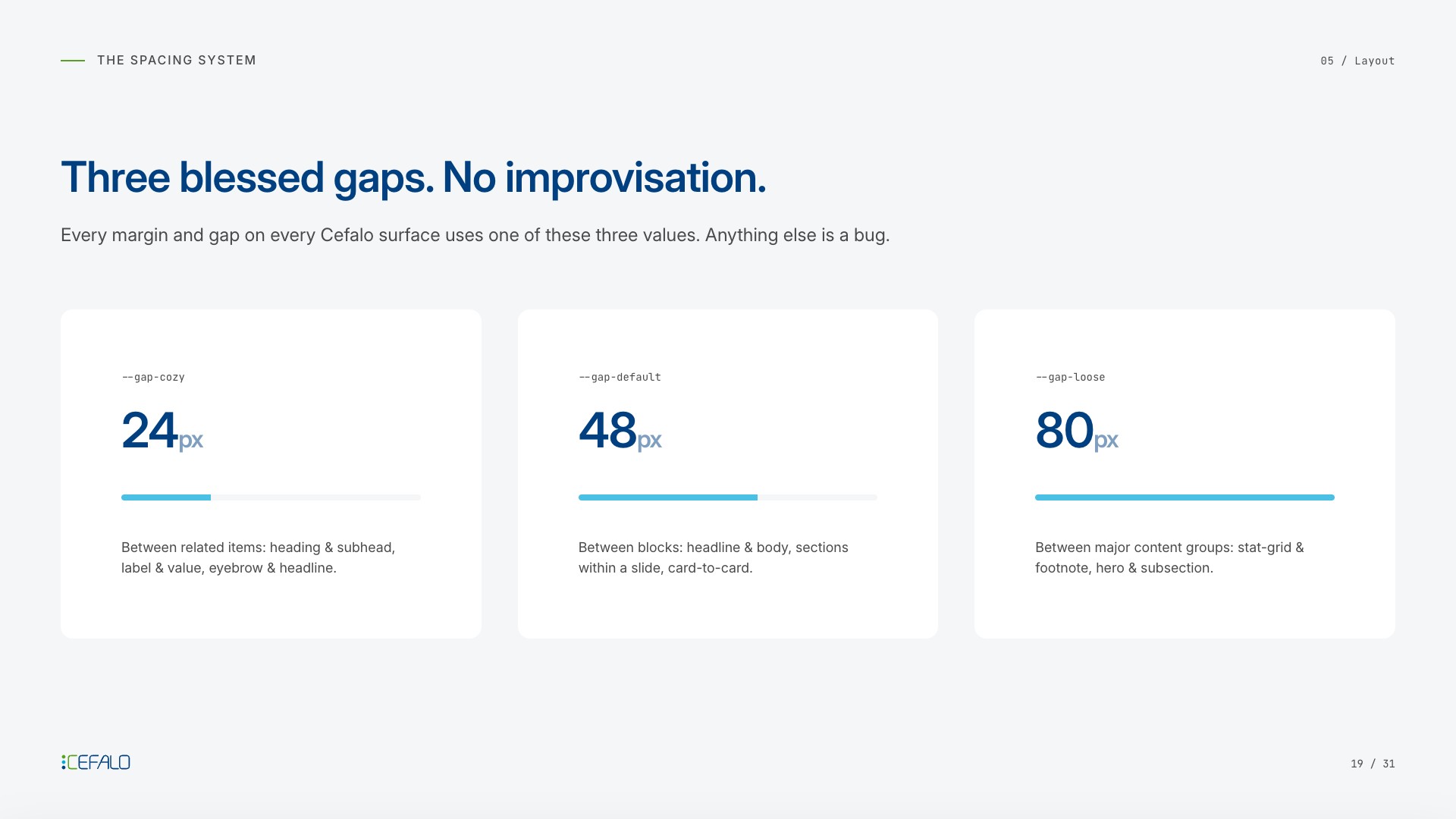
v1.0.2 is a working kit in three phases: rules, reference files and demo deliverables. Every number below is a real file or rule in the package.
The system prompt a Claude Project follows on every chat
Logo, colour, type, layout, data, imagery and voice
A 16:9 HTML deck that already follows the rules
Every variant, the dot stack and the iC hero mark
Display XL to Eyebrow, all in Inter
One per deliverable: pitch deck, one-pager, job ad, report…
Also in the box: a setup checklist, an onboarding guide, a logo proof sheet, a live type specimen, a rollout playbook and a changelog.
03Built to be operated by Claude
The package was designed to be loaded into a Claude Project, so anyone can ask for a deliverable in plain language.
A teammate opens the Cefalo Brand Project and describes what they need, for example a one-pager on embedded teams for a CTO audience.
Claude follows the project instructions and knowledge files: the right logo variant, Inter at the right scale, safe zones, spacing tokens and voice.
The result is a draft. A person checks it, and a designer reviews the pieces that really need one, such as pitch finals.
v1.0.1Claude Projects don’t accept SVG uploads, so the original instructions failed at rollout. The fix was one Markdown logo reference with all 14 variants as inline SVG, while the real SVG files stay in the package for designers.
v1.0.2Project file search began depending on the workspace’s code-execution setting. Without it, the knowledge files go silently invisible, so the rollout now starts with an owner-only Step 0 to enable it, with network egress kept minimal.
These are package decisions from the changelog. They record how the system was adapted to the platform at the time, not claims about current Claude features.
04Logo system
The mark is three signals and a wordmark, and five variants cover every background.
 PrimaryOn paper and mist
 ReversedOn navy and dark photography
 Mono navyOne-colour print
 Mono inkOn cyan and green surfaces
 Symbol onlyFavicons and avatars
Logo variants shown from the package’s own SVG files, on the backgrounds the guidelines assign them.
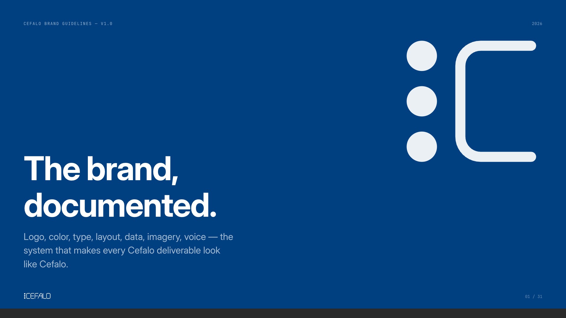
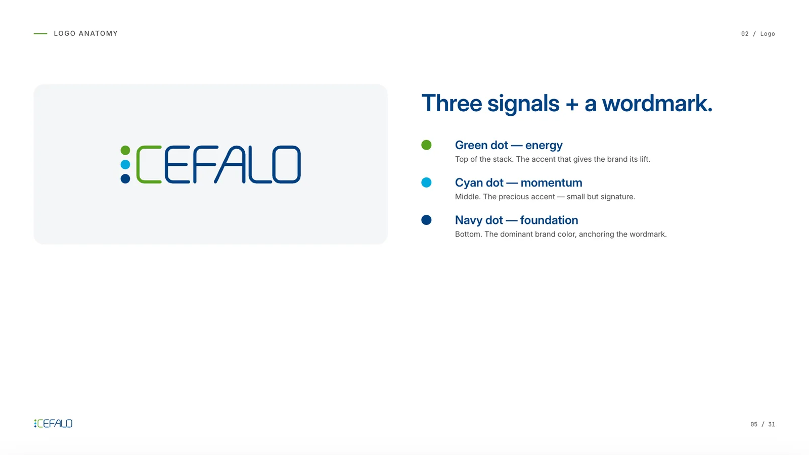
The green, cyan and navy dots stand for energy, momentum and foundation, and the green C ties the wordmark back to the first dot. The iC hero mark, a stylized version of the logo’s left edge, is reserved for covers and dividers.
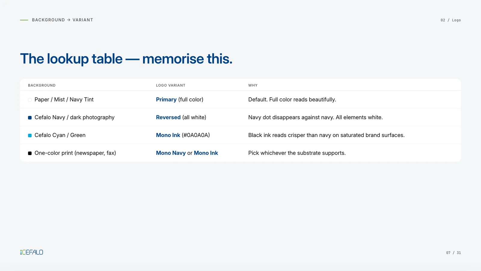
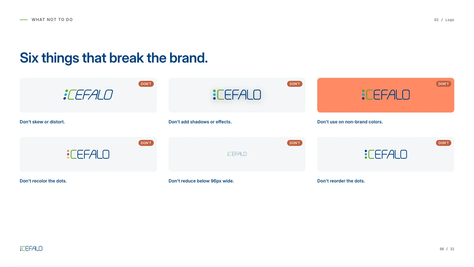
The lookup table turns logo choice into a lookup instead of a judgment call, and the misuse slide shows the six mistakes people actually make. The package also fixed an asset bug: the artwork touched the edges of its viewBox, clipping the final O. Each mark now has explicit padding in its viewBox.
05Colour roles
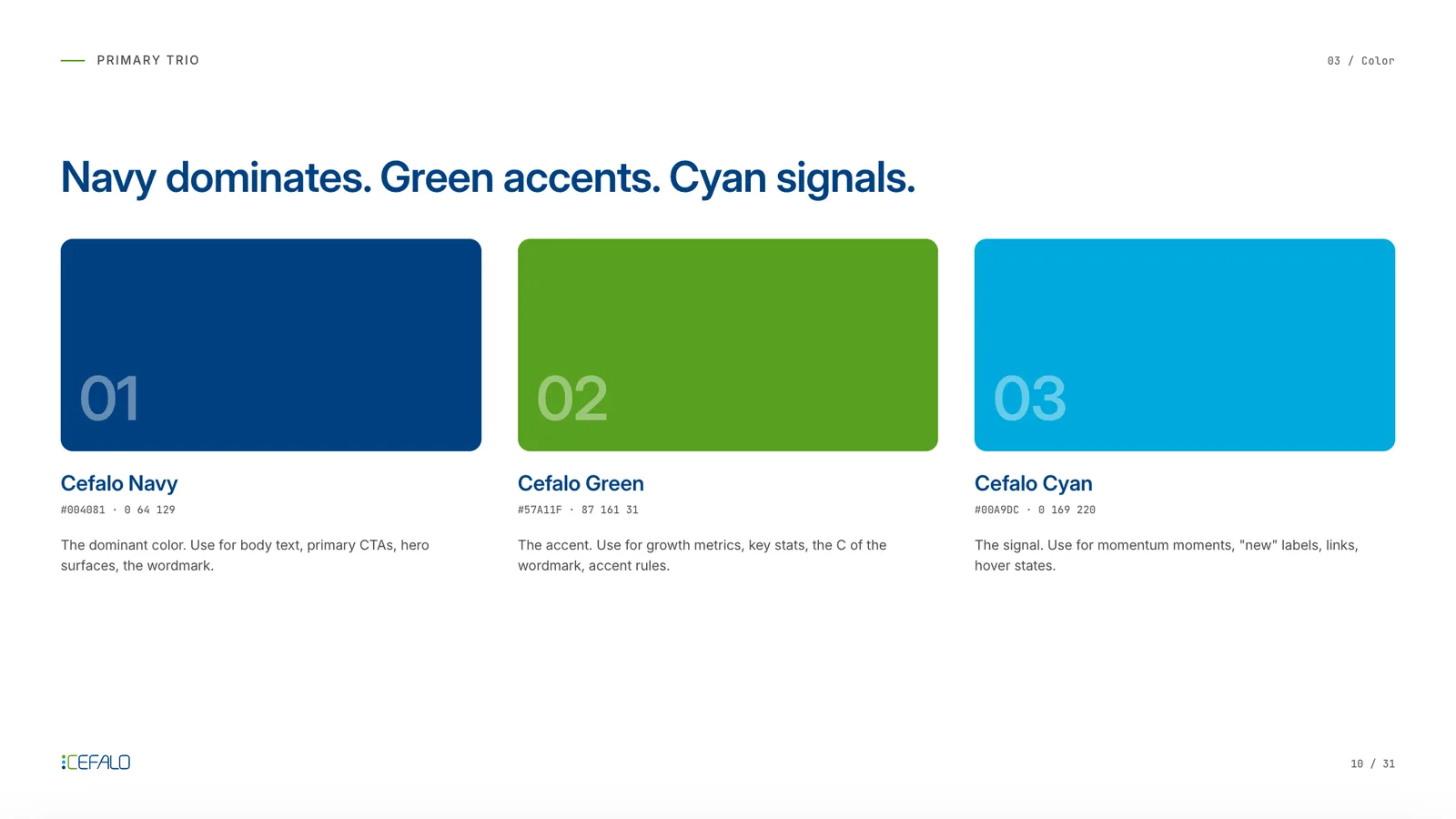
Navy dominates. Green accents. Cyan signals. Ten supporting colours exist for special cases only.
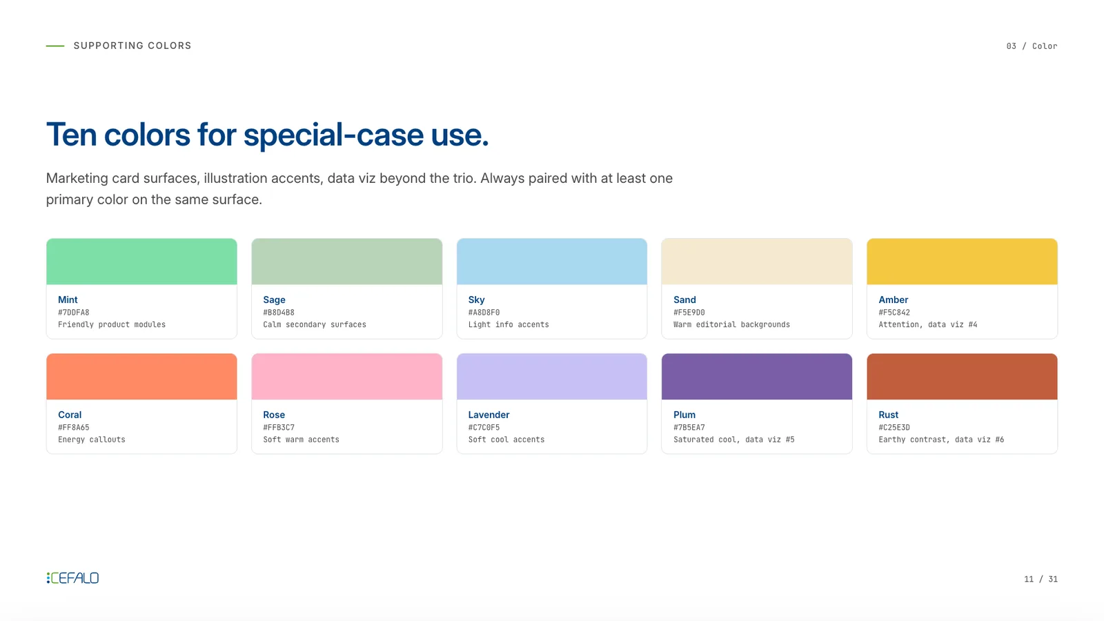
The supporting palette (mint, sage, sky, sand, amber, coral, rose, lavender, plum and rust) is for marketing card surfaces and later data-viz series. It never touches the logo and is never a primary call to action. Charts use navy, green and cyan first, then amber, plum and rust.
When the palette later reached code, contrast measurements set the text rules. Cyan text on white is 2.72:1 and green is 3.22:1, both below WCAG’s 4.5:1, so both are used as grounds that carry dark ink (7.27:1 and 6.15:1). Cyan stays a focus ring only on navy, where it clears 3:1; on light grounds the ring is navy. Where brand guidance and accessibility disagree, accessibility wins, and the reason is written beside the rule.
06Type, zones & spacing
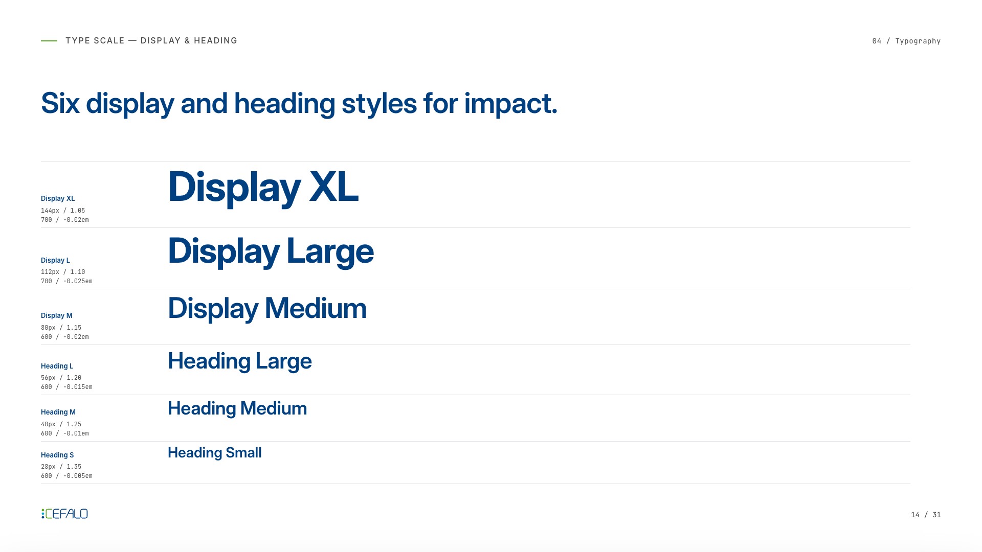
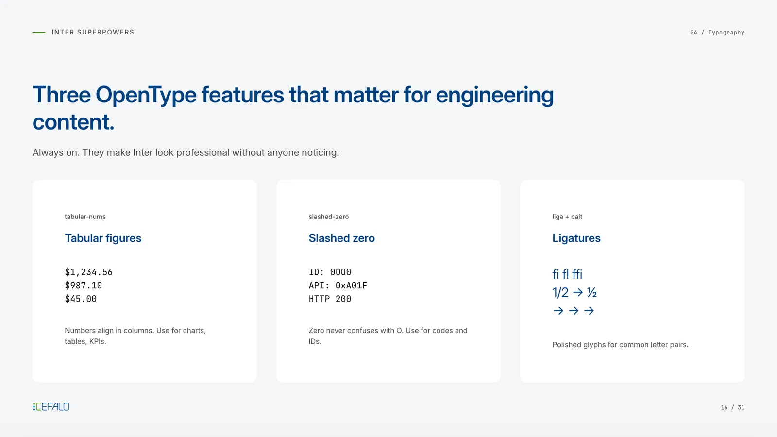
Inter for everything, JetBrains Mono for code and tabular numbers, and a slide that’s divided before anyone starts typing.
Specimen set in Inter at portfolio scale; the package’s own type slides are below.
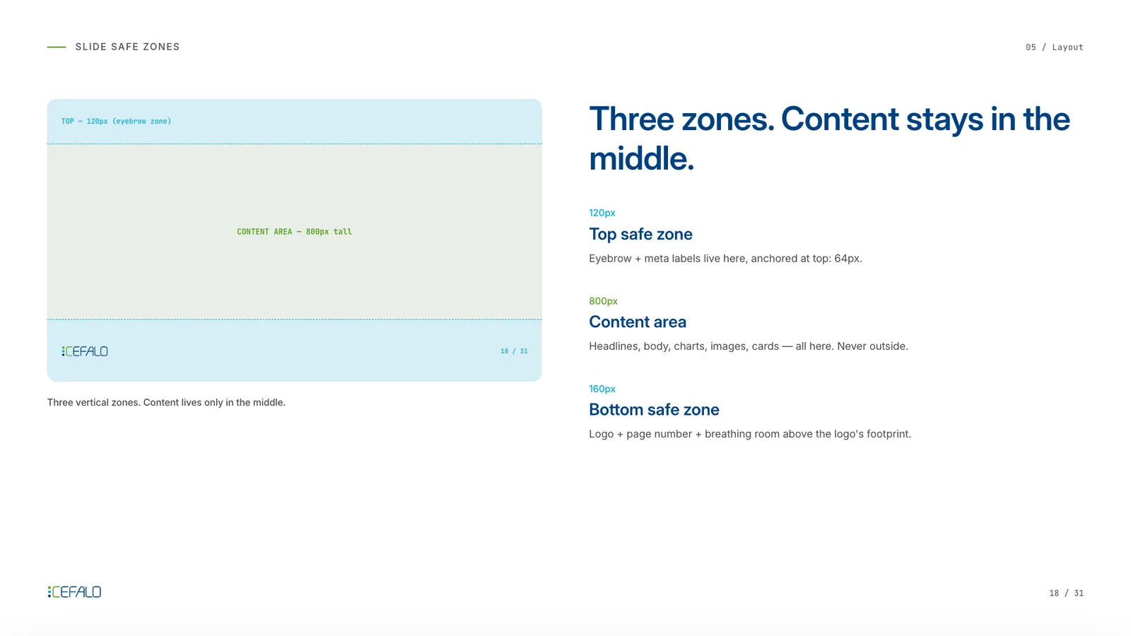
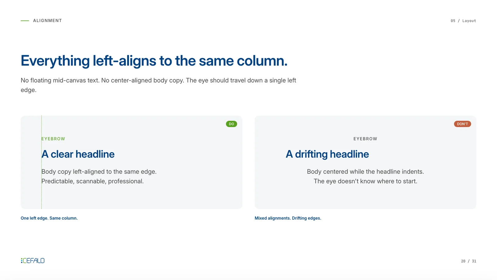
Content never enters the safe zones, and footnotes indent to clear the corner logo. Everything left-aligns to one column. The density limits push people to cut content before they shrink the type. The scale belongs to the slide canvas; what travels to other formats is the relationship between styles, not the pixel values.
07Brand vs. site tokens
The hardest brand lesson happened later, in code, on the company website.
When the identity palette was adopted for internal tools (a post builder, its admin and a carousel renderer), one commit also pointed the public site’s accent and inverted-band tokens at the new colours. Every button and every dark band on the public pages changed at once, and nobody had asked for it. It was reverted the same day.
The rule that replaced it separates two layers. Brand tokens name what the brand is. Semantic tokens say what a particular surface renders, and the public site keeps tracking cefalo.com. Changing those is a client decision, not a token edit, and a test now fails if someone retargets them.
--brand-*What the identity is: navy, green, cyan and the dot stack
--accent, --bg-invert, --focus…What a specific surface renders, decided per product
Public site · post builder · admin · rendererEach maps semantics to brand values on purpose
Summarized from the design-system rules and token tests in the Cefalo design-site repository.
08Applications
Applications test whether the rules survive real materials, sizes and lighting.
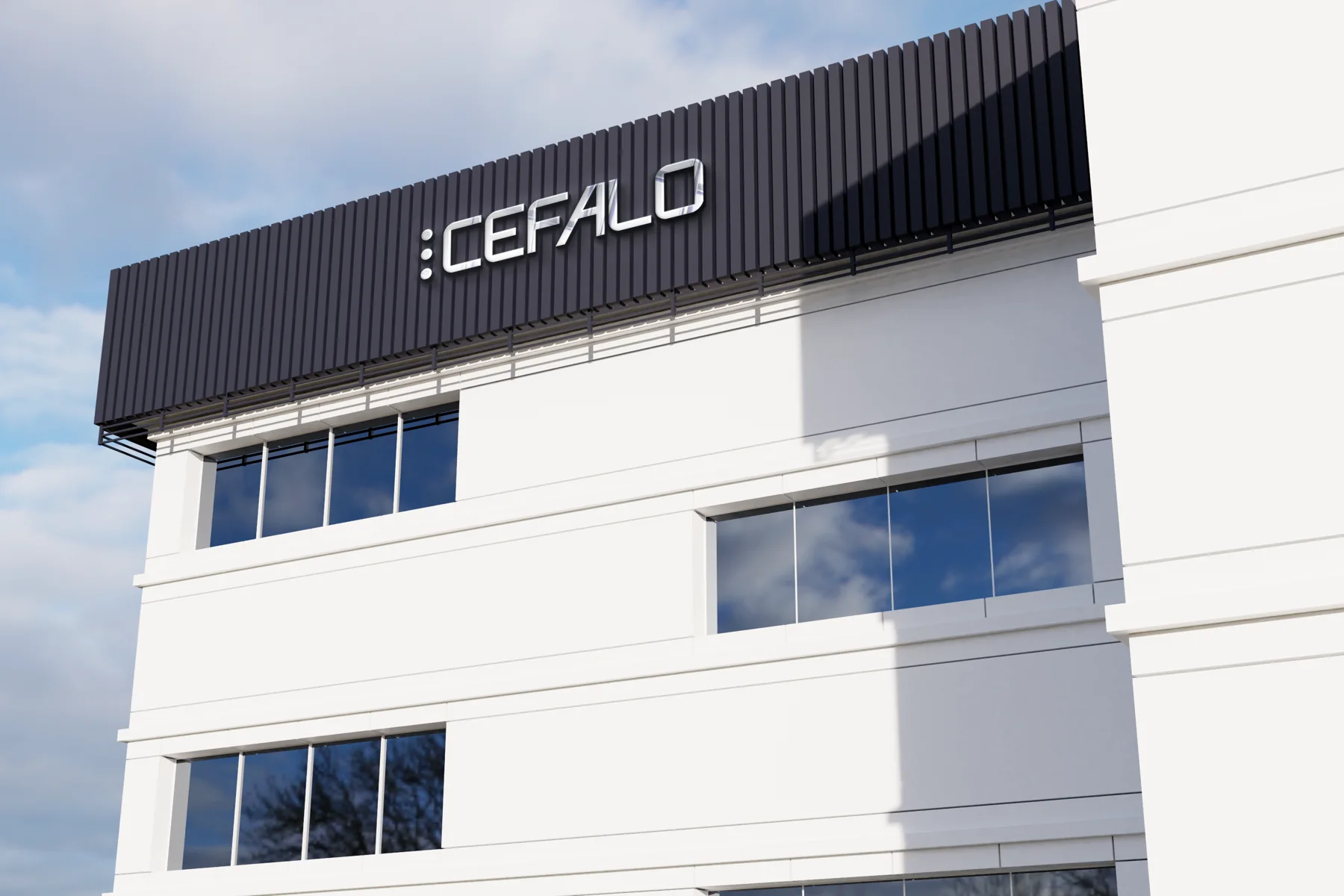
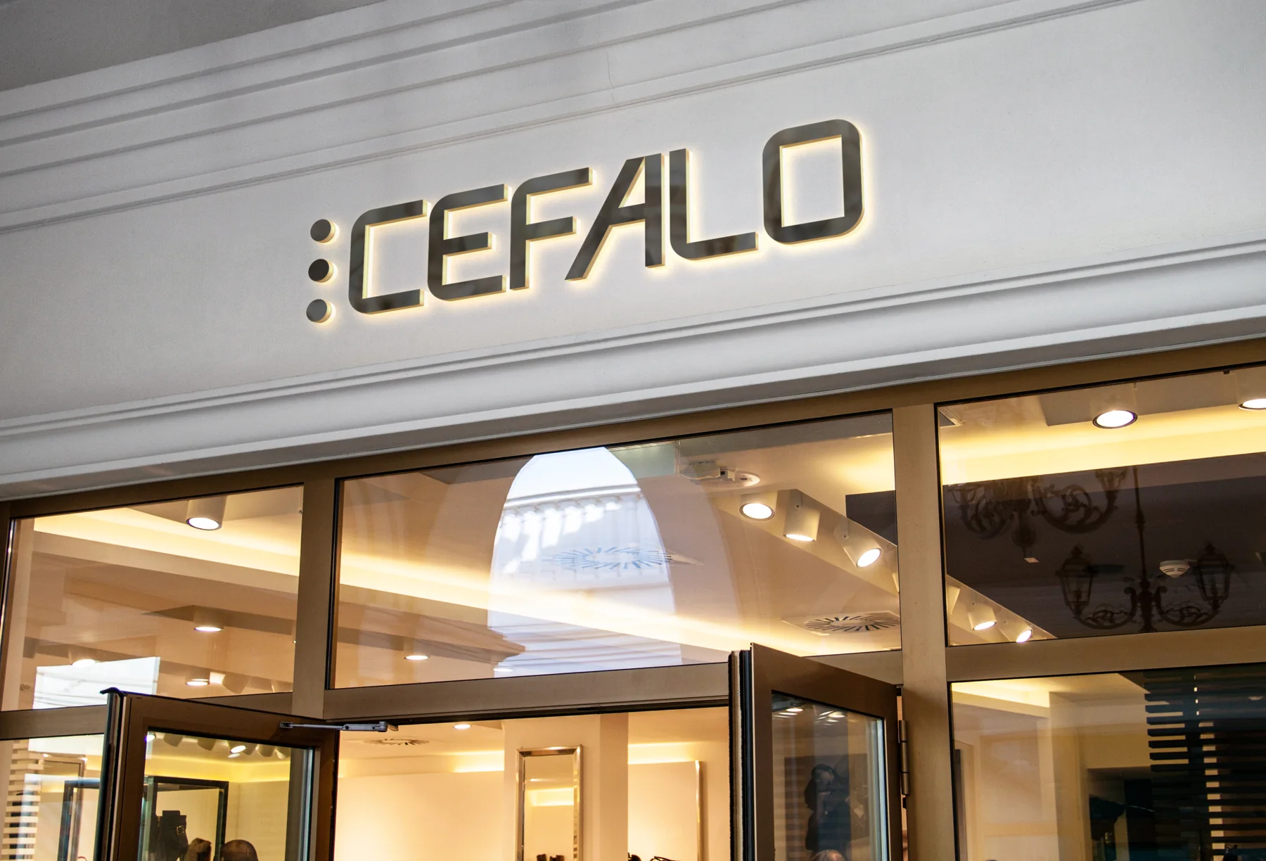
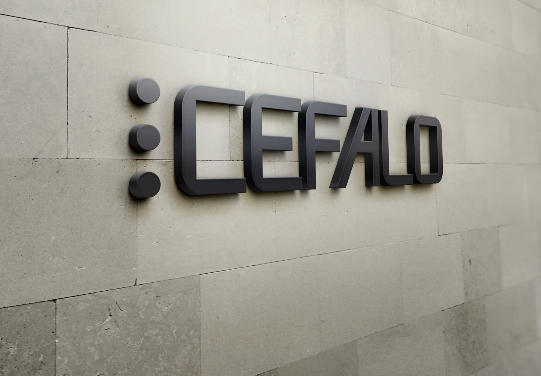
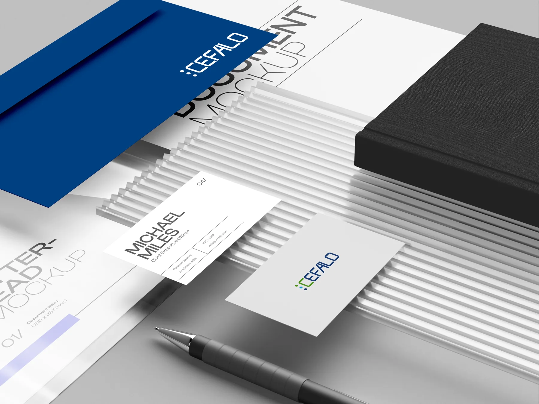
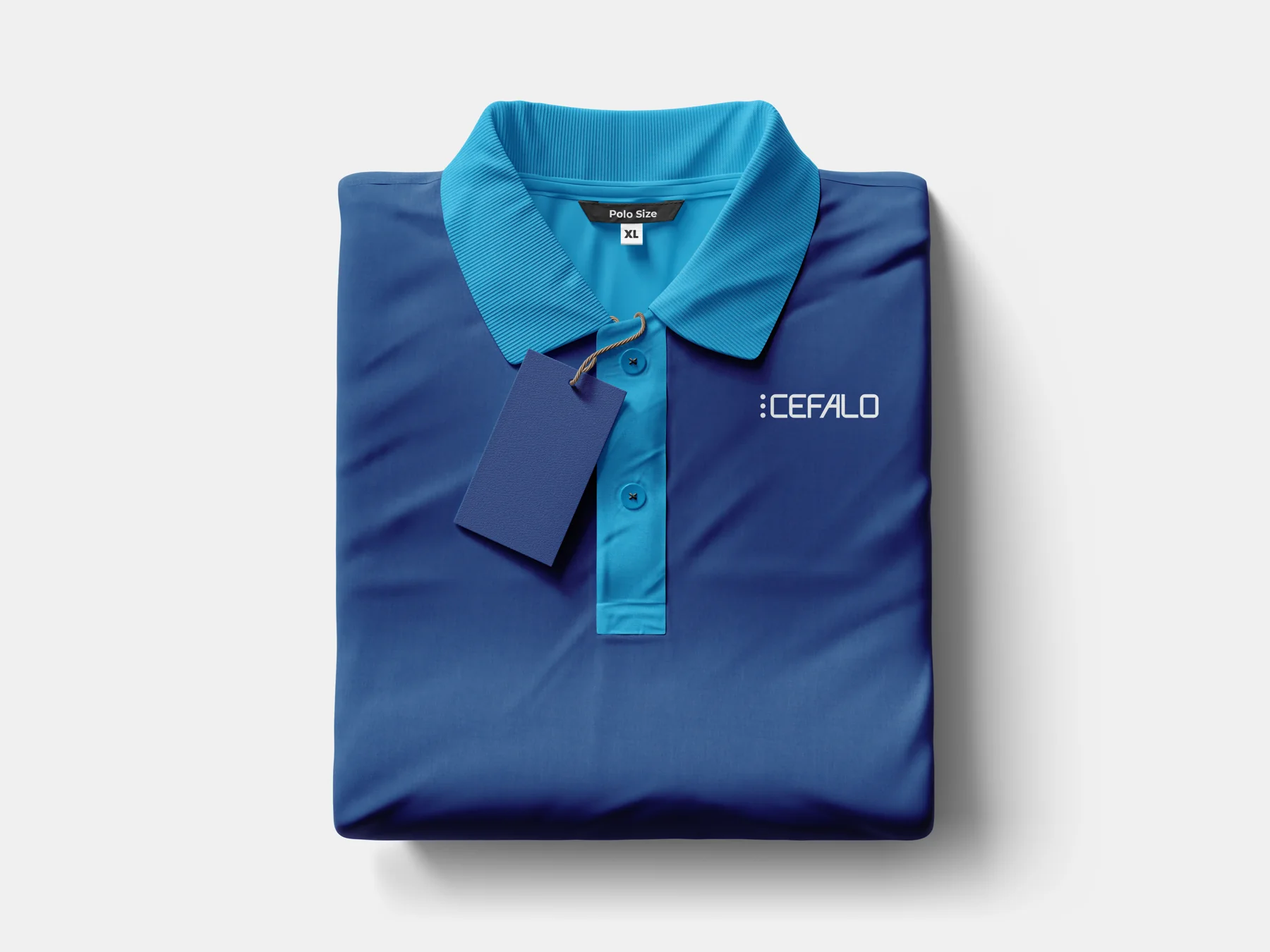
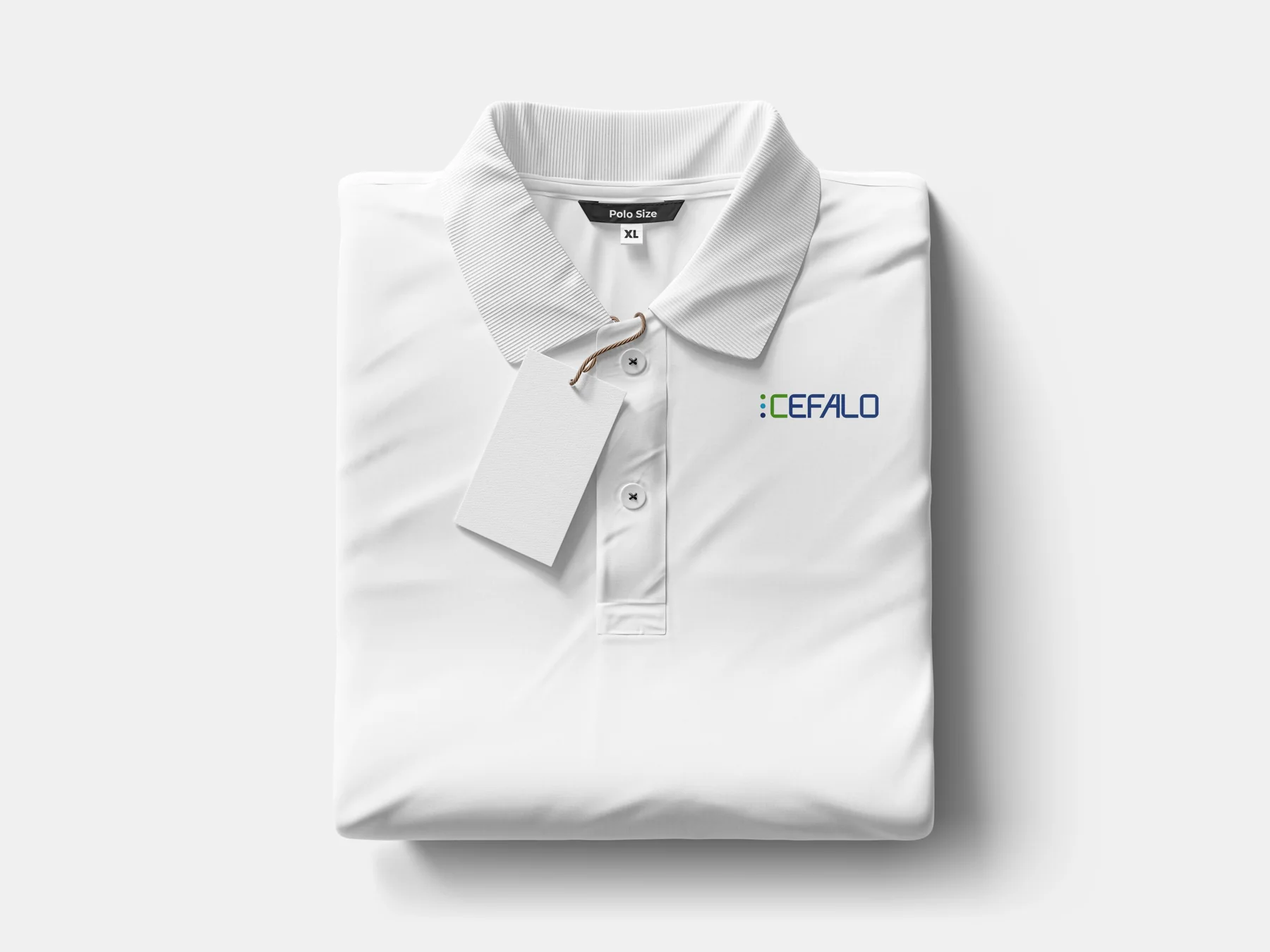
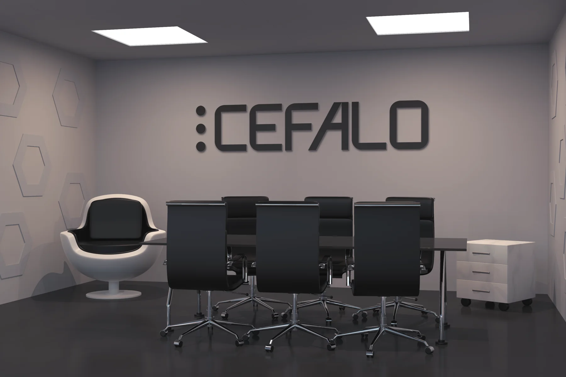
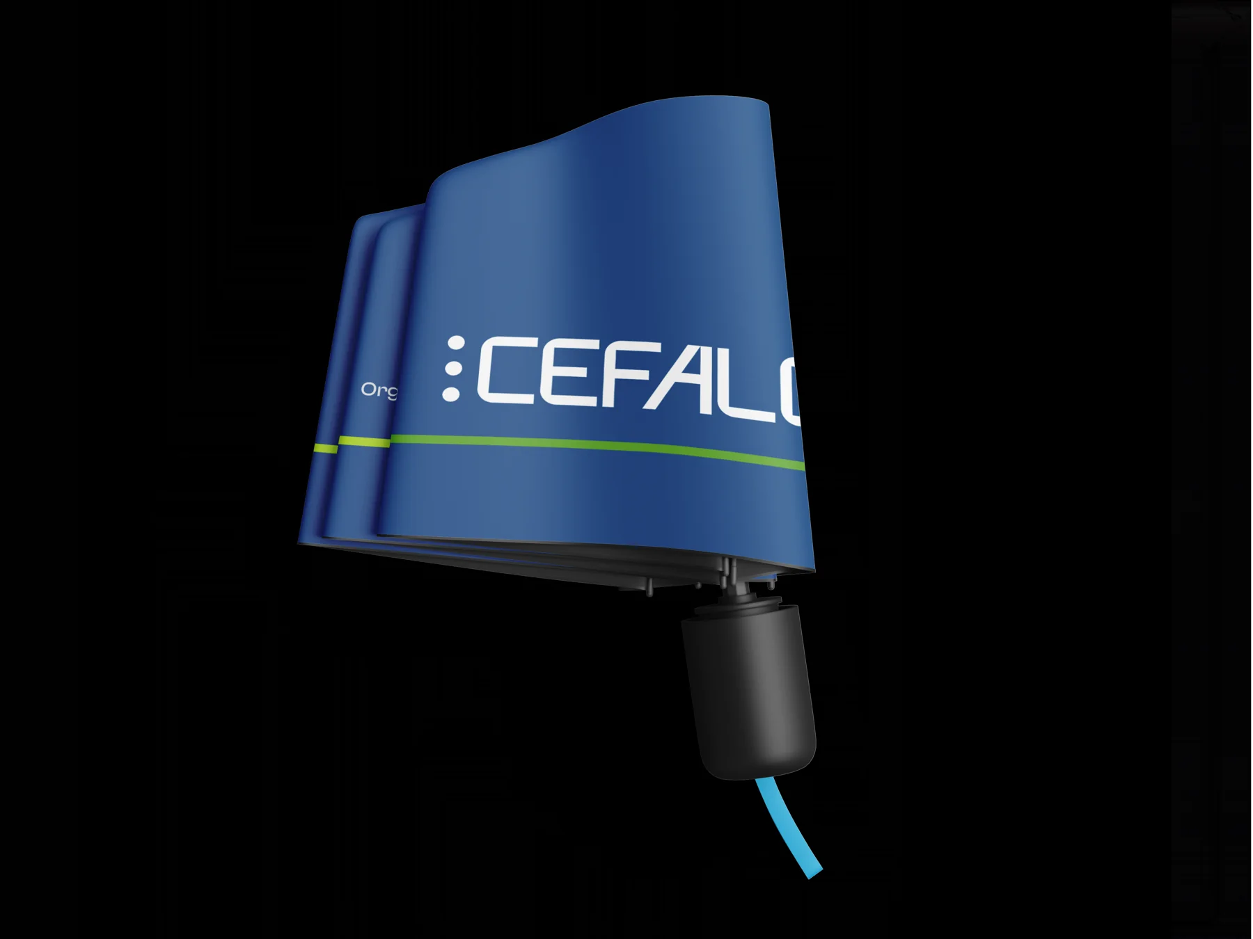
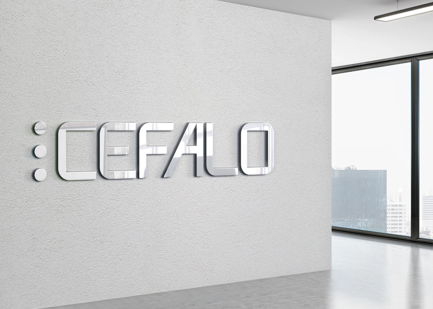
Presentation mockups made with supplied mockup templates, not photographs of installed or produced items.
09Voice
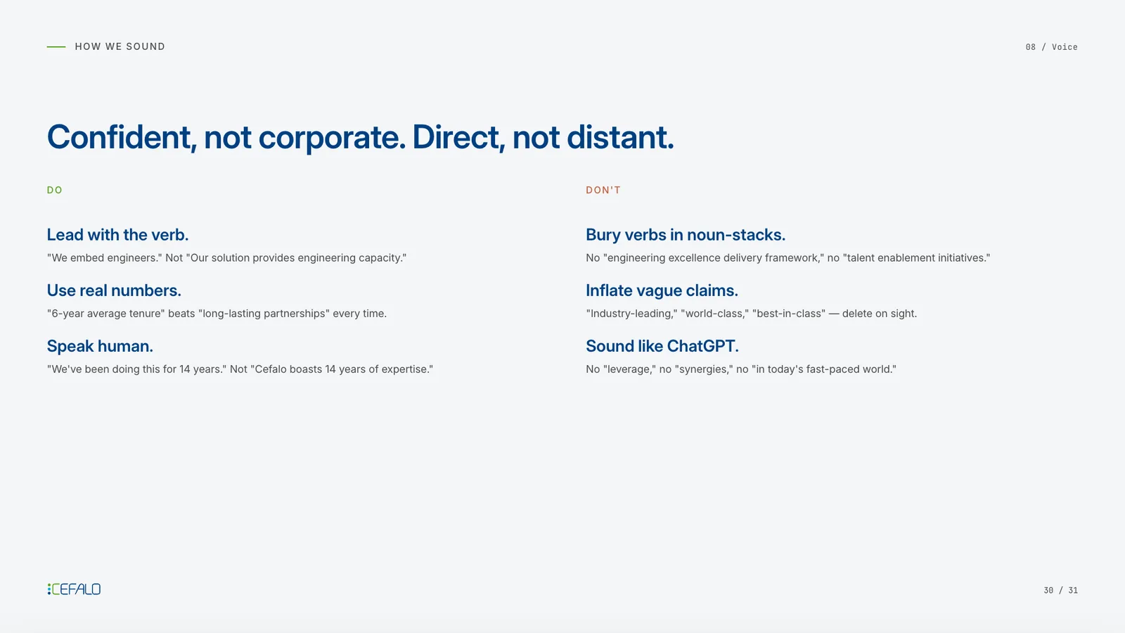
Confident, not corporate. Direct, not distant. Friendly, not formal.
10Accessibility
WCAG 2.2 AA is the bar for anything functional: text, links, controls and focus. APCA is a supplementary check when choosing type size and weight.
These are the rules the system is designed to. A logo or palette on its own doesn’t make an interface accessible, and no formal audit is claimed here.
11Rollout & ownership
A brand system decays without an owner. The rollout plan makes ownership a step, not an afterthought.
One person on the brand team owns the Project before it’s announced: they update the instructions, read feedback, approve new templates and run a quarterly audit.
The owner spot-checks chats, turns off-brand results into instruction refinements and unmet requests into new templates, then reviews weekly and later monthly.
A new colour, chart pattern, voice change or logo update each has a documented list of files and deck slides to update, then the instructions are re-exported.
The PDF renderer drops slashed zeros the browser shows, a known limitation in the changelog. Review the delivered file, not just the preview.
12In-house products
The brand system isn’t only for slides. The same identity carries into the tools Cefalo uses every day.
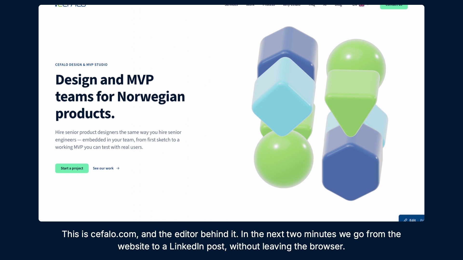 Implemented web and content platformCefalo Design Platform →The bilingual English and Norwegian marketing site, its in-context editor and a Post Builder that turns articles into carousels.
 Internal productCefalo HR Portal →A universal Android and iOS app for leave, attendance, travel NOCs and employee activity, with a minimal interface and clear request status.
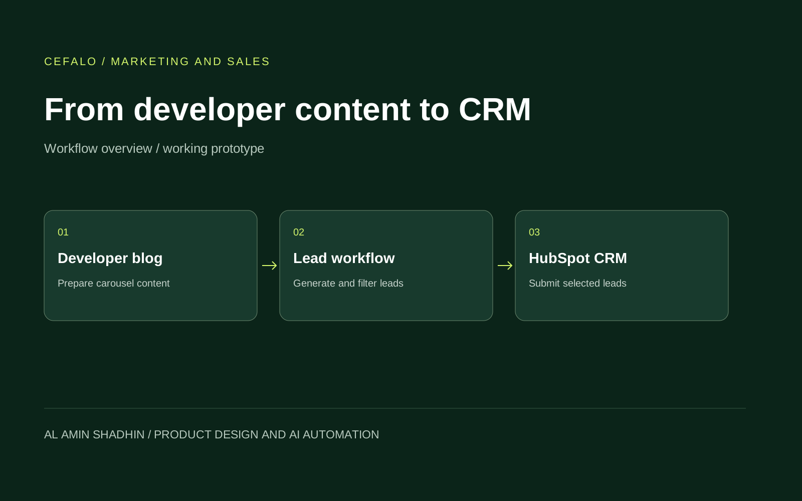 Working prototypeCefalo Content & CRM →Developer blog posts become LinkedIn carousel drafts, and selected leads are reviewed before they’re submitted to HubSpot. A person approves every step.
Each has its own case page. The HR portal and Content & CRM claim no measured productivity or sales results.
13Scope
No adoption, speed or business figures are claimed, including the package README’s own estimates. The demo annual report and data-viz slides use illustrative figures and aren’t shown. Physical applications on this page are mockups.
The most useful thing in this system isn’t a colour or a font. It’s the reasons written next to the rules, so the next person, or the next model, doesn’t undo a decision they can’t see.