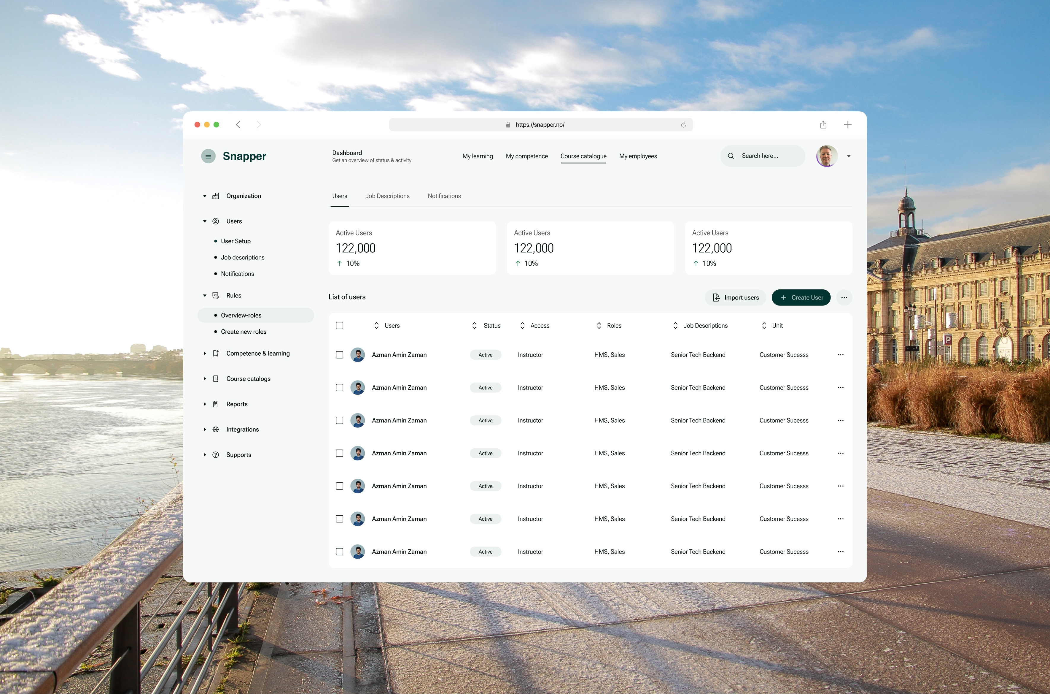
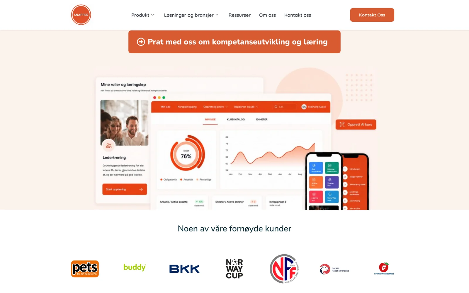
Snapper helps organisations manage learning and competence: who works where, which roles they hold, what they need to learn and how they’re progressing. Its users range from employees checking their own courses to administrators managing users, roles and job descriptions across a company.
01Two products
A learning platform and a renovation service.
Two clients, two very different jobs to be done.
Flip helps people get a renovation done: choose what needs doing, get quotes from vetted tradespeople, follow the job and finish with payment. Its users are homeowners who may do this once, so every step has to explain itself.
The temptation with two systems is to make one. The work was the opposite: share the method, keep each product’s vocabulary, structure and brand its own.
02My part & the team
Client work, with clear lines of ownership.
Both were client assignments through Cefalo, with the client’s team and Cefalo engineers.
What I did
- Product UX/UI: information architecture, flows, screen design and states for each product.
- A Figma component library per client, built on the framework the engineers used.
- Theming decisions that connect each product to its client’s brand.
- Handoff and implementation review with the developers.
What the team did
- Client stakeholders in Norway owned the product direction, business rules and acceptance.
- Cefalo engineers implemented the products and owned technical and release decisions.
- Each client’s brand guidelines were the reference for identity; I applied them in the product.
This case doesn’t imply a shared library between the two clients, or ownership of either client’s whole platform.
03Starting from a framework
Adopt, theme, extend, or build.
Starting from Ant Design or Element Plus saves engineering time, but it also brings defaults that make every product look the same. Each component went through the same four questions.
- 01Adopt
Use the framework component as is.
Tables, pagination, date pickers: behavior people already know and engineers don’t need to rebuild.
- 02Theme
Keep the component, change the tokens.
Colour, type, radius and spacing tuned to the client brand, so the product stops looking like the framework.
- 03Extend
Wrap or compose framework parts.
A user row with avatar, status and role chips, or a service card that combines several primitives.
- 04Build
Design something the framework doesn’t have.
Only when the domain needs it, such as a renovation progress tracker, and then documented as a new component.
Described as the working method used across both libraries. Specific token values and component counts stay in the private client files.
04Snapper: learning admin
Orientation first in a dense admin.
Snapper’s admin side is dense by nature, so the design work was mostly about orientation.
My learningMy competenceCourse catalogueMy employees
- Organization
- UsersUser setup · Job descriptions · Notifications
- RolesOverview · Create new roles
- Competence & learning
- Course catalogs
- Reports
- Integrations
- Supports
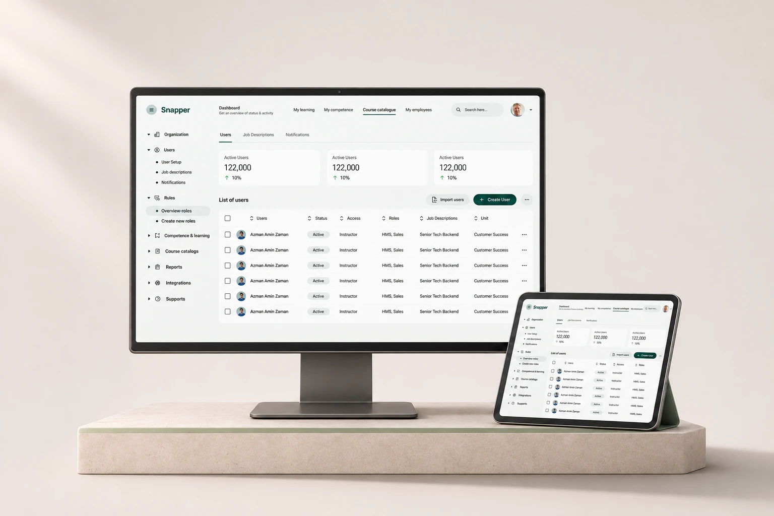
Two navigation layers do different jobs. The top bar follows the person: their learning, their competence, the course catalogue and, for managers, their employees. The left navigation follows the organisation: users, roles, competence, courses, reports and integrations.
The user list carries the most weight. Each row shows the person, their status, access level, roles, job description and unit, with sortable columns, bulk selection and two clear actions at the top: import users, or create one. Status is a labelled chip, not just a colour.
Navigation and labels read from the project presentation. The user rows in that image are repeated placeholder data.
05Flip: renovation journey
One decision per step, progress always visible.
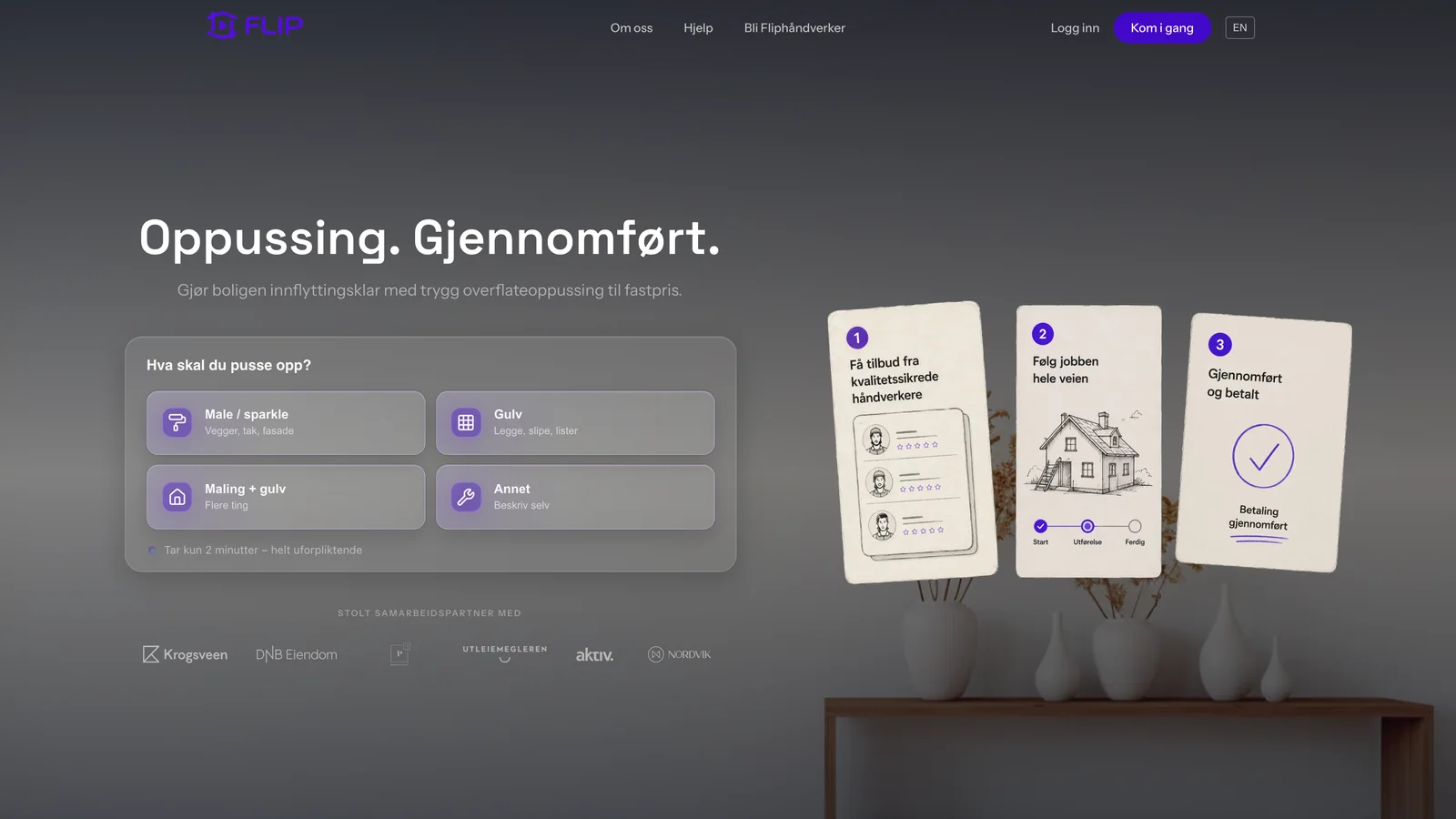
Flip’s journey is short and linear, and most of its users are doing it for the first time.
Homeowner / From idea to a finished job
- 01Choose the jobPick a renovation type, or describe something else
- 02Get quotesOffers from quality-checked tradespeople
- 03Follow the workProgress from start to in progress to done
- 04Done and paidCompletion and payment confirmed together
- Not sure what it’s calledAn “other” option lets people describe the job in their own words.
- Incomplete detailsThe form names the missing field and keeps everything already entered.
Journey reconstructed for this case from the confirmed scope and the public site. It isn’t an original flow file.
The work was mapping a renovation into clear steps, with forms that ask only what each step needs, visible progress and recovery when something is missing. The public site expresses the same promise in its own words: “Oppussing. Gjennomført.” (renovation, done).
06Same method, different answers
Why the two libraries don’t look alike.
The same questions, asked in two domains, produced different answers.
| Aspect | Snapper | Flip |
|---|---|---|
| Who it’s for | Employees, managers and administrators | Homeowners, often first-time |
| How often | Daily and repeated | Occasional, once per project |
| Density | High: lists, filters, bulk actions | Low: one decision per step |
| Navigation | Two layers: personal and organisational | Linear steps with visible progress |
| Key component | The data table and its row states | The step form and progress tracker |
| Framework base | Ant Design | Element Plus |
07Components & states
Different products, different edge cases.
Most of the library work is in states, and each product needs different ones. These are the kinds of states each library had to cover.
Snapper: lists and records
- Empty list with an import action
- No results for a filter, with a way to clear it
- Row selected and bulk actions shown
- Inactive user, labelled, not just greyed out
- Long names and many roles without breaking the row
Flip: steps and forms
- Step not started, current, done
- Required field missing, named next to the field
- Saving and saved
- Quote pending, received, accepted
- Payment confirmed
Representative states drawn for this page from the confirmed scope (feedback, progress and recovery states). The private component specifications aren’t reproduced here.
08Accessibility
Theming shouldn’t undo the framework’s work.
WCAG 2.2 AA is the target for both products, with APCA as a supplementary readability check. Both frameworks give a head start on keyboard support and ARIA, but theming can easily undo it.
- Keep the framework’s semantics
- Theming changes how a component looks, never its roles, labels or keyboard behavior.
- Re-check contrast after theming
- A brand colour applied to buttons, links or chips is checked again at WCAG thresholds.
- Tables people can navigate
- Real column headers, sortable headers announced as buttons, and selection that works with a keyboard.
- Status in words
- Active and inactive, or step states, are labelled as well as coloured.
- Errors next to the field
- Each error names the field and how to fix it, and entered data is kept.
- Targets and focus
- Controls meet 24 × 24 px or have enough spacing, with a visible focus ring the theme doesn’t remove.
Design targets, not audit results. No formal conformance review is claimed.
09Handoff & boundaries
Every handoff starts with the client’s name.
With two clients in parallel, the most important thing in a handoff is which product it belongs to.
Name the client first
Every brief, page and component starts with the client and its library, so a Snapper pattern never leaks into Flip.
Say which level it is
Adopt, theme, extend or build tells engineers whether to use the framework as is, change tokens, compose parts or write something new.
Show the states
A component is ready for build when its empty, error, loading and long-content states are drawn.
Share the method, not the files
Improvements to how the libraries are documented travel between clients; visual and behavioral changes stay in the one they belong to.
For AI-assisted work, the same rule applies: the brief loads only the right client’s brand and component references, so Claude or Codex can’t borrow another client’s visual rules or content.
10Scope
What I delivered, and what I’m not claiming.
- Product UX/UI for Snapper’s learning and competence administration, delivered through Cefalo.
- Product UX/UI for Flip’s renovation journey, June to August 2024.
- A separate Figma component library for each client, built on Ant Design and Element Plus respectively.
- A shared working method: adopt, theme, extend or build, with documented states and a client-first handoff.
No usage, conversion or speed figures are shown. The client websites on this page are context, and the dashboard figures in the Snapper presentation are placeholders. Private libraries and product screens aren’t published.
Consistency is local. A good library makes each product feel like itself, and the method is the only thing that should travel between clients.