Rebuilding TicketCo’s organizer platform on one shared system.
TicketCo’s Web 1.0 to 2.0 redesign, through Cefalo. I worked on the product design for organizer and buyer flows, and managed the Figma library that design and engineering worked from.
The platform already carried years of operational depth: event setup, ticket types, memberships, season tickets, gift cards, cashless and reporting. The job was to make that depth easier to work with on any screen, without taking it away from the organizers who rely on it.
Management and stakeholders in Norway, a team in Ukraine, developers in Dhaka
Engagement
Primary TicketCo assignment through Cefalo; approximately 80% across TicketCo work
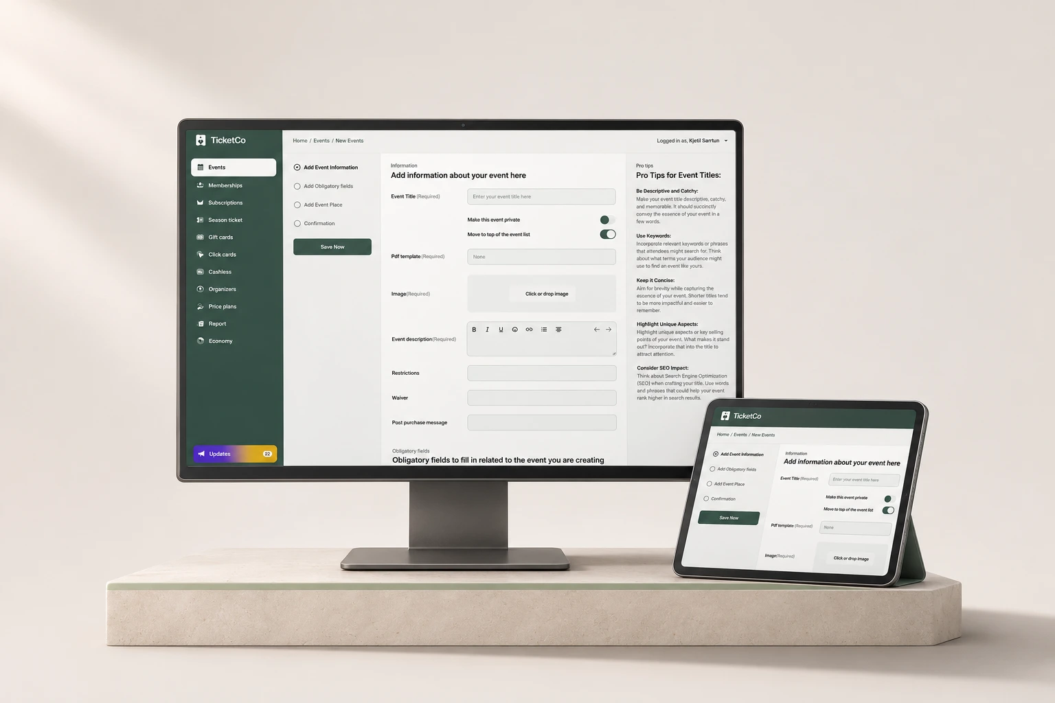
Published TicketCo product film / Event creation in the redesigned organizer dashboard
01Context
A platform with years of depth, built one screen at a time.
TicketCo is an event and ticketing platform used by organizers across Norway, Sweden and the UK. Web 1.0 worked, but it had grown one screen at a time.
Organizers use it to set up events, sell tickets, run memberships and season tickets, sell gift cards and click cards, handle cashless payments and read sales reports. Buyers meet the same platform through club and venue pages, seat maps and checkout.
The issues we started from were familiar ones for a long-lived SaaS product: a dated interface, dashboards that needed a lot of manual work, screens that didn’t hold up on mobile, rigid operational flows and inconsistencies between areas built at different times. Each part of the product solved its own problem, so the same action could look and behave differently from one module to the next.
The constraint that shaped everything: experienced organizers depend on that depth. A cleaner 2.0 that hid or removed operations they use every week would not have been an improvement.
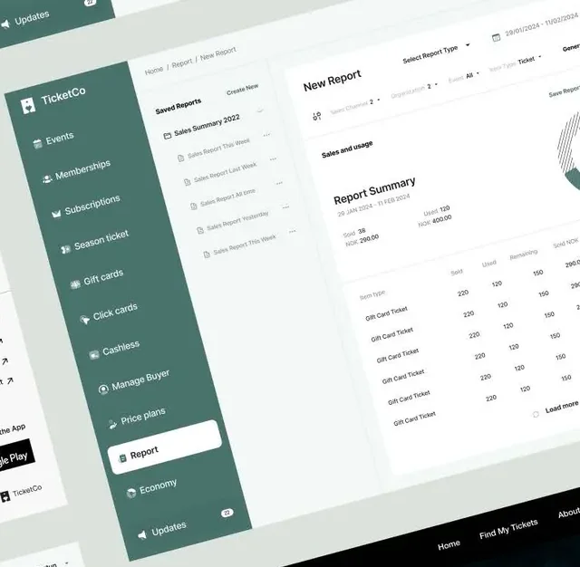
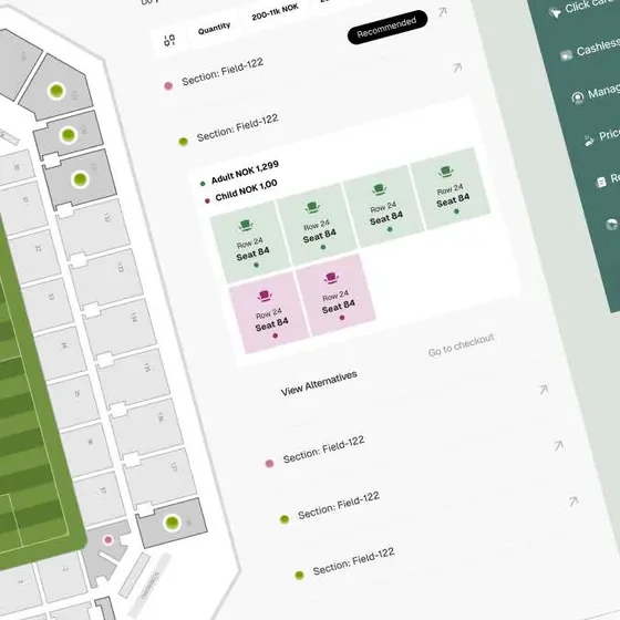
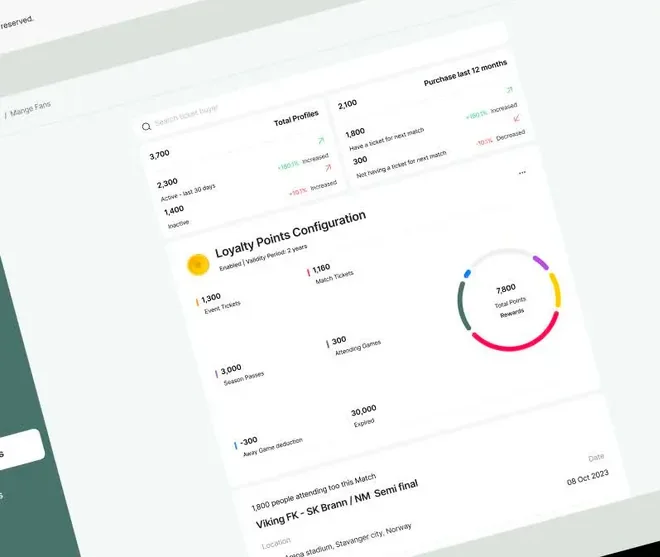
Published project presentation / Organizer dashboard, reporting, loyalty and buyer screens from the 2.0 work
02My part & the team
Three countries, one product conversation.
This was team work across three countries. The split below is how the responsibilities actually divided.
What I did
Product design for the 2.0 organizer and buyer surfaces: event setup, ticket sales, reporting and analytics, and responsive layouts.
Managing the TicketCo core library in Figma: its structure, components, variants and interaction states, and keeping it current as the product changed.
Defining how shared patterns carry across responsive web and native contexts, and where platform behavior should differ.
Engineering handoff and implementation review with the developers, and preparing the library for Claude- and Codex-assisted implementation.
What the team did
Management and stakeholders in Norway set product direction, priorities and the business rules each workflow had to respect, and accepted the work.
The team in Ukraine worked on the product with us. Design, product and implementation questions were discussed together rather than handed over once.
Developers in Dhaka built Web 2.0 on a React-based component system and owned the engineering decisions, performance work and releases.
Engineering ownership, release decisions and production metrics belong to the wider team. This case describes my design contribution.
NorwayManagement & stakeholders
Direction, priorities, business rules, acceptance
UkraineProduct team
Shared reviews of design, product and implementation questions
DhakaDevelopers
React implementation, engineering and performance decisions
Shared referenceDesign & the Figma library
Flows, components, states and the handoff reference everyone reviewed against
Collaboration model / Who contributed what to each decision
Most of this happened remotely: design critique, stakeholder reviews and Jira. Because the reviewers were spread across time zones, the Figma library and its page status had to explain a decision without me in the room.
03Discovery & discussions
Agree on what Web 1.0 does before redrawing it.
Before redrawing screens, the team needed a shared picture of what Web 1.0 actually did.
Discovery meant walking through the existing workflows: how an organizer creates an event, configures ticket types and seating, follows sales and pulls a report. We collected the patterns that repeated with small differences across modules. Those inconsistencies became the shortlist for the library, and the older screens eventually went into a clearly marked “Not in use” area of the Figma file so nobody would build from them by accident.
The discussions with Norway and the developers kept coming back to a few questions. These are the working questions, not a meeting transcript or research findings:
Q1Which legacy actions must stay one step away for experienced organizers?
Modernizing the layout must not bury operations people use every week.
Q2What can web and native share, and where should platform behavior differ?
Shared tokens and components, with navigation and input that follow each platform.
Q3Where does an organizer commit a change, and how do they recover?
Long setup tasks need a safe draft state and specific, field-level errors.
Q4What does an engineer need from a component before building it?
States, responsive behavior and acceptance notes, not just a static screen.
Detail from the published presentation / Saved reports and a report summary
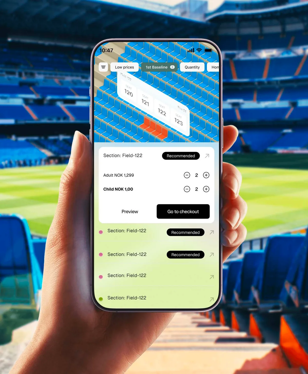
Detail from the published presentation / Section recommendations and selected seats
Detail from the published presentation / Loyalty-points configuration
04Flows
Two journeys carried most of the redesign.
Two flows carried most of the redesign: an organizer creating an event, and a buyer choosing seats.
Organizer / Create an event
01Event informationTitle, privacy and list position, PDF template, image, description, restrictions, waiver, post-purchase message
02Obligatory fieldsInformation the buyer must provide at purchase
03Event placeVenue and location details
04ConfirmationReview before the event goes live
Save nowAvailable on every step, so a long setup can stop and resume as a draft.
Missing required fieldThe field is identified where it is, and the organizer returns to that step.
Buyer / Choose seats
01Event or club pageFind the match or subscription
02Seat mapFilter by price and quantity; sections show availability
03Recommended sectionPick a suggested block or view alternatives
04Tickets & quantityAdult and child quantities per section
05Preview or checkoutCheck the selection, then pay
Seats no longer availableReturn to the section list with alternatives, keeping the chosen quantity.
◇Reconstructed for this case study from the shipped interface. These are explanatory diagrams, not original project flow exports.
05Wireframe studies
Settle the structure before the styling.
Low-fidelity studies made the layout logic easy to debate before any visual detail.
Event informationObligatory fieldsEvent placeConfirmationSave now
Title*PrivacyTemplate*Image*Description*
01 / Event setup workspace
Step list with completed states and a persistent Save now
One form section at a time, required fields marked in text
Guidance in a side rail instead of long helper text in the form
Saved reports
TypeDatesChannelEvent
Load more
02 / Reports
Saved reports sit next to the report being built
Filters across the top: report type, date range, channel, event
Summary first, then a table that loads more on request
PriceQuantityFilter
RecommendedAdult− 2 +Child− 2 +PreviewCheckout
03 / Mobile seat selection
Map on top for orientation, decisions below
Recommended section with a text badge, not color alone
Quantity steppers per ticket type, Preview before Checkout
◇Wireframe studies redrawn for this case from the delivered screens. They explain the structure; they are not original wireframe files.
AI-generated presentation mockup / The real event-creation screen placed on desktop and tablet for this portfolio
06The Figma system
One library, from foundations to Ready for dev.
The core library is organized the way the product is built: from foundations up to the two page families engineers ship.
TemplatesReusable page structure, separate from any one screen
Pages · Admin SalesOrganizer screens, marked Ready for dev
Pages · Ticket BuyerBuyer screens, marked Ready for dev
Not in useOlder pages are kept under “Not in use”, so the history stays available without being mistaken for the current direction.
Library structure and component names verified from a read-only view of the Figma file. “Ready for dev” is a Figma page status, not a release claim. Exact token values and variant counts aren’t shown here. Open the library ↗
Typography: Public Sans
Public Sans is the family in the library’s Typography foundation. It has separate desktop and mobile heading styles, subtitle and body styles, and underline and line-through treatments for links and changed prices.
Aa
Add information about your event
Report summary
Section: Field-122 · Adult NOK 1,299 · Child NOK 1,00
View alternativesNOK 1,499 NOK 1,299
◇Set in Public Sans. Sample lines come from the shipped interface; the sizes here are illustrative, not the library’s token values.
07Components & states
Draw the edge cases, not just the happy path.
Most of the design-system work is in the states. A component isn’t ready for handoff until its edge cases are drawn.
Illustrative component states: rows are components, columns are states
Component
States
Button
Save nowDefault
Save nowHover
Save nowFocus
Save nowDisabled
Saving…Loading
Text field
Event titleEmpty
Spring concertFilled
Spring concertFocus
Event titleDisabled
Spring concertEvent title is requiredError
Quantity stepper
−0+Zero
−2+Value
−2+Focus
−0+Sold out
−8+Limit reached
Section status
AvailableAvailable
RecommendedRecommended
Few leftFew left
UnavailableUnavailable
ChangedChanged
◇Illustrative specimen of the state coverage the library documents. Drawn for this page; not the production components.
08Prototype behavior
Agree on how it behaves, then how it looks.
Prototypes were used to agree on behavior, not just appearance.
Published project presentation / Buyer seat selection on mobile
01Steps remember progress
Completed steps show a check mark; the organizer can go back to any earlier step without losing input.
02Drafts are always one click away
Save now stays in the step rail, so leaving halfway is a normal outcome, not an error.
03Settings say what they change
Toggles such as “Make this event private” and “Move to top of the event list” sit next to the fields they affect.
04Buyers check before they commit
Preview and Go to checkout are separate actions, and the recommended badge is text, so it doesn’t rely on color.
09Design decisions
The calls that shaped the rest of the system.
A few calls shaped the rest of the system. Each is written as rationale and trade-off, not as a measured result.
D1
A stepper with drafts, not one long form
Event setup has a lot of required information. Splitting it into Event information, Obligatory fields, Event place and Confirmation, with Save now on every step, lets organizers work in sessions. The trade-off is more navigation, which the step rail makes visible.
D2
Guidance in a rail, not inside the form
Tips for writing event titles and descriptions live beside the form. The form stays scannable for experienced organizers, while newer ones still get help where they are working.
D3
Specs that match how the product is built
Components were specified against the Tailwind-based guidelines and React component system the developers use, so spacing, states and variants translate directly instead of being re-interpreted per screen.
D4
Two page families on shared foundations
Admin Sales and Ticket Buyer serve different people, so they get separate templates and pages. They share atoms and molecules, which keeps the platform recognizably one product.
D5
Performance is part of the spec
Reports summarize first and load table rows on request. Operational screens reuse existing components and avoid one-off assets. These are design considerations for the build; no speed improvement is claimed.
10Accessibility
Accessible behavior is part of each component.
WCAG 2.2 AA is the target for these patterns, with APCA as a supplementary readability check and EN 301 549 for European public-sector expectations.
Steps and progress
The step list is a list of links, with aria-current="step" on the active one and completed state in text, not only a check icon.
Errors that point somewhere
Required fields are labelled in text. Errors name the field and sit next to it (3.3.1, 3.3.3). A multi-step setup doesn’t ask again for information already given (3.3.7).
Keyboard and focus
Logical tab order through rail, form and actions; a focus ring that stays visible and isn’t covered by the sticky header (2.4.7, 2.4.11).
Targets and alternatives
Quantity steppers and chips meet the 24 × 24 px minimum (2.5.8). The seat map has a list-based route, so choosing seats never depends on precise pointing or dragging (2.5.7).
Data tables
Reports use native table markup with headers. The WAI-ARIA grid pattern is only for cases that really need cell-by-cell navigation.
Status without color
Availability, recommendations and toggles carry a text label or icon as well as color (1.4.1), with contrast checked at WCAG thresholds (1.4.3, 1.4.11).
These are the criteria the components are designed against. This page doesn’t claim a certified audit or formal conformance.
11Handoff & maintenance
A handoff that works without the designer in the room.
The handoff had to work for engineers in another time zone, and later for AI coding tools working from the same references.
For engineers
Build from pages marked Ready for dev; anything under Not in use is history, not spec.
Use the component’s Figma name, which matches the code component, plus its variant and state.
Every component handoff covers default, hover, focus, disabled, loading, empty and error, plus responsive behavior.
Acceptance notes describe behavior (what saves, what blocks, what recovers), not only appearance.
For Claude and Codex
Point Claude or Codex at the specific Figma component and the existing code component, not a screenshot.
State the organizer task and every state that must exist, including empty, loading and error.
Name the accessibility requirements and what not to introduce, such as new one-off styles.
Review the result against the library like any other pull request.
Example implementation brief / Format used for engineers and AI coding tools
Task
Implement the Event information step of event creation.
Use
Stepper, Text field, Select, toggle and Button from the core library; existing React components.
States
Empty, filled, required-missing, saving, saved draft, server error.
Accessibility
Labels in text, errors linked to fields, aria-current="step", visible focus.
Don’t
Add new colors, spacing values or a component that already exists.
Verify
Keyboard-only pass, 320 px reflow, compare against the Ready for dev page.
When a pattern changes, for example a validation rule, it changes once in the library and is then checked across the dashboard, the native experience and any AI-assisted implementation. Retired patterns move to Not in use instead of being deleted.
12Outcomes & scope
What shipped, and what I’m not claiming.
Web 2.0 design-system work for TicketCo was delivered through Cefalo.
Ticket sales, event setup, analytics, responsive layouts and interaction states were standardized on one core library.
The library has Admin Sales and Ticket Buyer pages marked Ready for dev, built on shared atoms, molecules and organisms.
Designers, developers and AI-assisted implementation work from the same component references.
No usage, speed or revenue figures are shown, because I don’t have measured results to report. Agentic reservations, seat-map building and AI-assisted allocation were separate working prototypes and aren’t part of this scope.
The most useful thing a design system did here wasn’t visual consistency. It gave people in Norway, Ukraine and Dhaka one place to settle a question, and kept that answer true as the product kept changing.