Tokens first
Every colour, size and space is a named token. A product swaps its brand tokens and inherits everything else, so a theme change is a file change, not a redesign.
Ridmik Product Systems
Building and maintaining a single, custom design system for Ridmik’s whole software ecosystem, then spending the time it gave back on listening to users.
Ridmik’s products grew one screen at a time, on Android, iOS and the web. I built one design system to support all of them: about 80% fewer UI inconsistencies, faster releases and lower cost. With the building blocks settled, the work moved to the experience, and Ridmik Keyboard grew from 10 million to 165 million users. Across every app on the system, that’s over 200 million people.
Keyboard home / Redesigned from the 2025 Figma file
01The problem
Every Ridmik product had grown on its own. Each one solved its own screens, in its own way.
The keyboard, Boitoi, Ridmik News, Dovashi and Retalik each had their own buttons, type scales, colours and spacing. Designers drew screens one at a time, and developers rebuilt the same components separately for every app and platform.
People felt it. Someone moving from the keyboard to Boitoi had to relearn simple things, and Bangla text, with its conjuncts and vowel signs, broke differently in every product. Releases were slow, and every new feature started from zero.
Before designing anything new, we needed to see how wide the gap really was.
02The audit
I put every product side by side and inventoried the interface: each button, field, card, list and state.
The products didn’t need five design systems. They needed one, with room for five personalities.
So we mapped what every product shared, and what had to stay its own.
03Ecosystem map
The map stacks the ecosystem in layers, from the decisions every product inherits to the parts that give each one its character.
Colour roles, Bangla-first type scale, spacing, radius, elevation, motion and iconography, expressed as design tokens.
Buttons, inputs, cards, lists, navigation, sheets, dialogs, toasts and empty, loading and error states.
Onboarding, settings, search, paywalls, sharing and permission flows, written once and tuned per product.
Brand colour, illustration, tone of voice and signature moments: a bookshop, a newsroom, a teacher, a store.
Android follows Material, iOS follows Apple’s HIG, and the web (Retalik) maps the tokens to Tailwind.
Diagram drawn for this case study. Brand colours are illustrative, not the products’ exact palettes.
Consistency lives in the lower layers. Character lives at the top.
With the layers agreed, the next step was building the system itself.
04The system
A custom design system, built once in Figma and mirrored in code, that every Ridmik product draws from.
Every colour, size and space is a named token. A product swaps its brand tokens and inherits everything else, so a theme change is a file change, not a redesign.
Line heights and sizes were tuned for Bangla conjuncts and vowel signs first, then Latin, so text stops clipping on every screen.
Each component ships with its default, pressed, disabled, loading, error and empty states, so developers stop guessing the edge cases.
Usage rules, do’s and don’ts, and specs sit next to each component, so design and engineering read from the same page.
color.brand.primarySwapped per productcolor.text.primarySharedtype.bangla.bodySharedspace.4 · space.8 · space.16Sharedradius.cardShared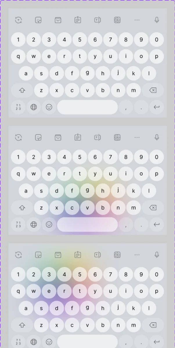
Token names are illustrative of the structure, not a copy of the production files.
With the foundation in place, the question changed from “how do we build this screen?” to “is this the right screen?”
05The payoff
The system paid for itself in the first releases it touched.
Developers assembled screens from ready components instead of rebuilding them, which cut development time and cost on every release. New products and features started from a working base, not a blank file. And design time moved from redrawing buttons to understanding the people using them.
The 80% figure is the team’s internal estimate from design reviews, not an audited metric. User figures are company milestones reached by the whole team.
That freed time went straight into listening.
06Listening
Store reviews, interviews, surveys and usability sessions pointed at the same handful of problems.
Poor setup and unclear choices were costing users in their first minutes.
Themes and personalisation were the most requested change.
Keys drawn as images made the keyboard slower than it needed to be.
There was no tutorial for people choosing between several Bangla layouts.
People didn’t want more features. They wanted the ones they used every day to feel effortless.
Rather than bet on one big redesign, we tested small.
07Try and drop
Because new screens came from the system, an idea could be built and shipped to a slice of users in days, not weeks.
Bangla typists choose a layout before anything else.
Taught on the setup screen, with a live keyboard, where it’s used.
Meets Android’s alarming keyboard warning head on.
Two layouts tested to balance discovery against the keyboard’s own settings.
The loop is how features were evaluated. Individual dropped experiments aren’t listed.
What survived the loop became the keyboard people use today.
08The keyboard experience
Each change came from what users said, and each one was built from the system.
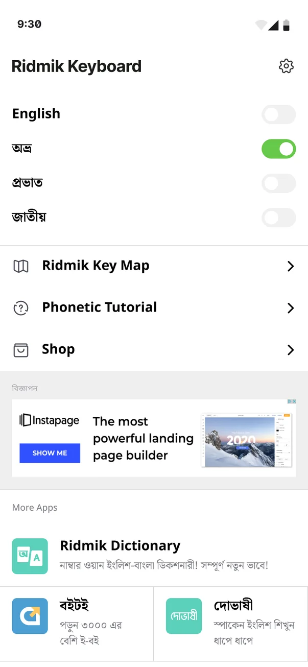
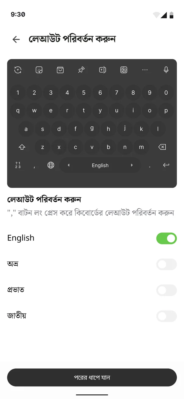
English plus three Bangla layouts, Avro (phonetic), Probhat and Jatiyo, each a simple toggle, with a Key Map, a Phonetic Tutorial and themes below.
Switching layout has to be instant, so the setup screen teaches one gesture with a live keyboard: long-press the comma key.
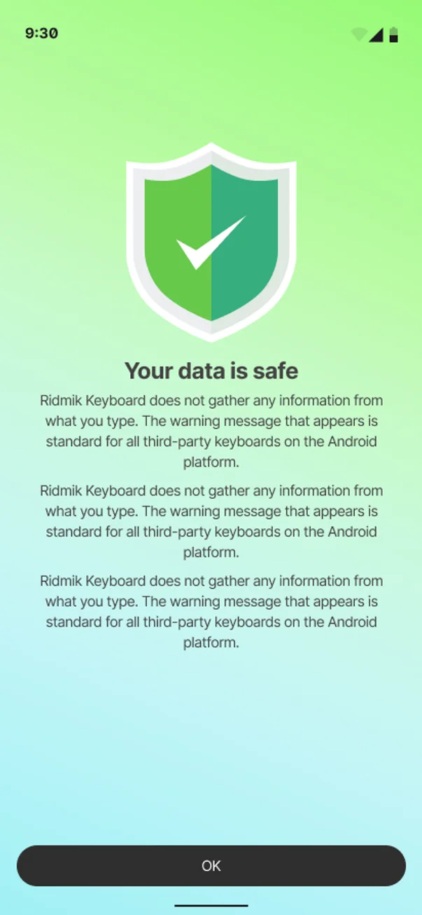
Android warns loudly when anyone enables a third-party keyboard. The “Your data is safe” screen explains that the keyboard doesn’t gather what people type, and that the warning is standard.
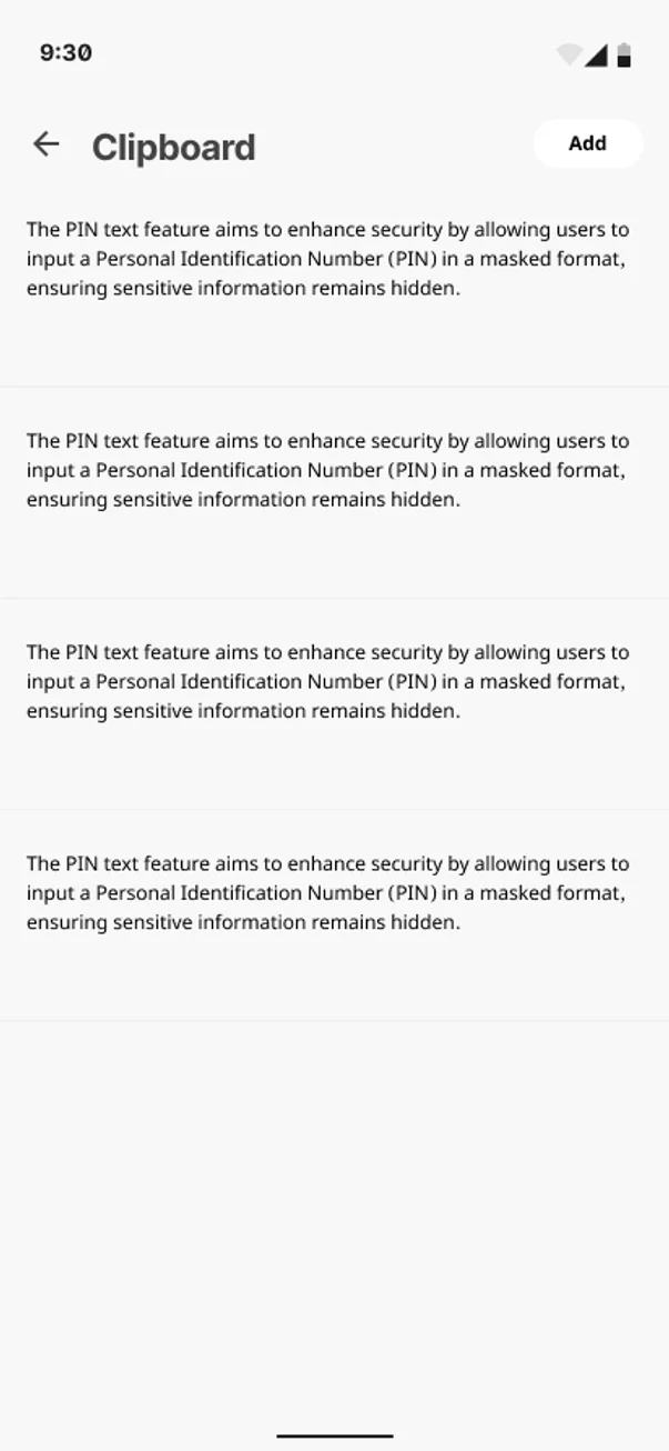
A PIN text option in the clipboard masks sensitive entries, so a code copied once doesn’t sit in plain view.
Themes range from quiet greys to soft gradients, and people can make their own. Every theme is built on the same tokens, so Bangla key labels stay readable whatever sits behind them.
In 2025 I designed an AI writing panel on the same system, with Make it Friendly, Rephrase and Emoji Boost above the keys. It’s separate from the 2018–2023 redesign.
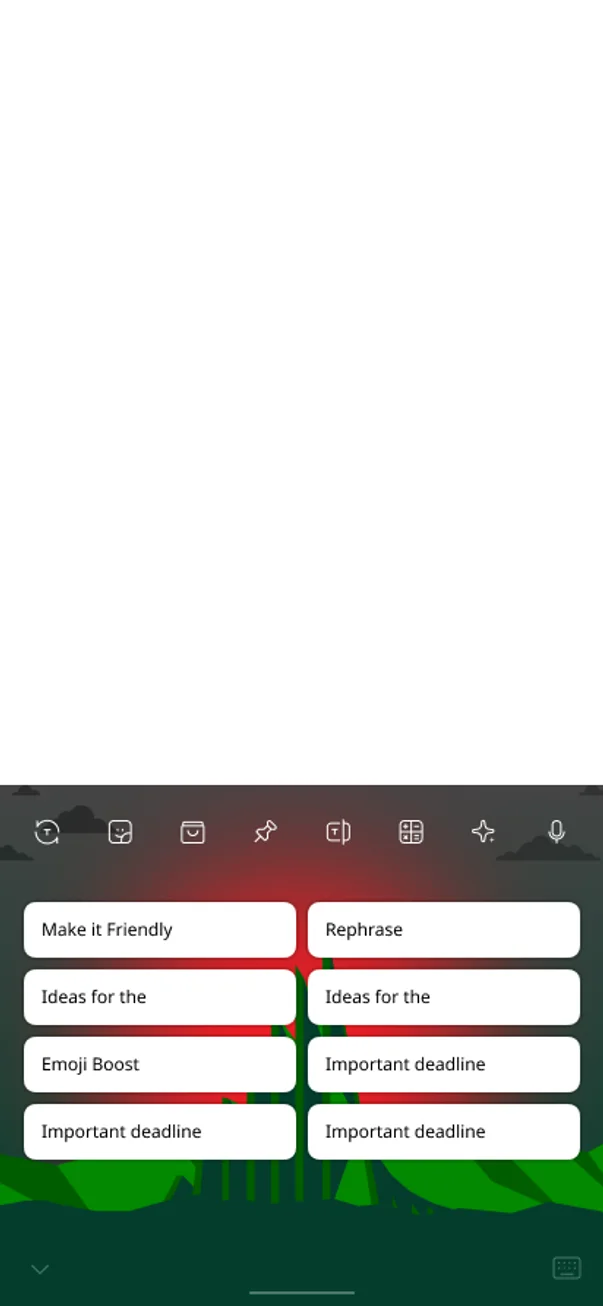
Screen labels read from the Figma file; privacy wording paraphrased. This describes the interface, not a security audit.
A better keyboard also became the front door to the rest of the family.
09Beyond one app
The product people open most is also how they discover the others, and the shared system makes the move feel familiar.
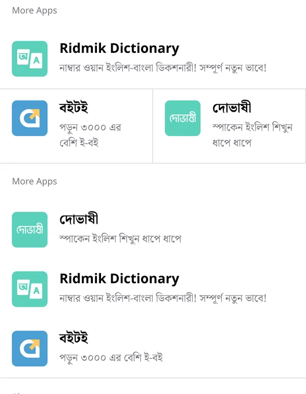
A “More Apps” module on the keyboard home introduces Ridmik Dictionary, Boitoi and Dovashi, each with a one-line promise. Because they share the same foundations, opening Boitoi or Dovashi feels like the same maker, not a stranger.
Identity stays separate on purpose. Boitoi feels like a bookshop, Ridmik News like a newsroom, Dovashi like a friendly teacher. Retalik took the system to the web, mapping the same tokens to a Tailwind-based component library for merchant and storefront screens.


Together, the system and the experience work showed up in the numbers.
10Outcomes
A consistent system and a user-led experience, across five years and five products.
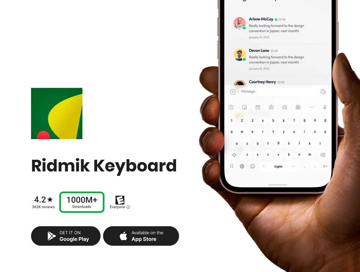
These are company and product milestones reached by the whole team: engineering, product, growth and design. I don’t attribute them to design alone. No revenue or retention figures are shown.
Hitting those numbers didn’t mean the system was done.
11After launch
It has to keep up with the products it serves.
Components changed through versioned releases, so a fix in one place reached every product without breaking the others.
New components were added when a product needed them and proved reusable, not ahead of time.
In 2025 the AI writing panel was designed on the same foundations, showing the system could absorb a new kind of feature.
Looking back, what stayed with me wasn’t the component count.
12Reflection
I started out trying to make five products look consistent. What mattered more was what consistency made possible: developers stopped rebuilding the same parts, and designers had time to sit with users, test ideas and drop the ones that didn’t work.
The system was never the product. It was what let the products listen.