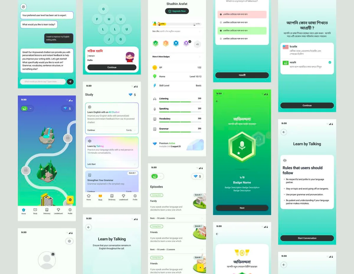
Dovashi / Original product presentation
01 / Dovashi
The problem
- Existing apps ignored local linguistic and cultural nuance.
- Users juggled multiple apps for vocabulary, grammar and practice.
- Learning felt tedious, lacking an enjoyable, interactive element.
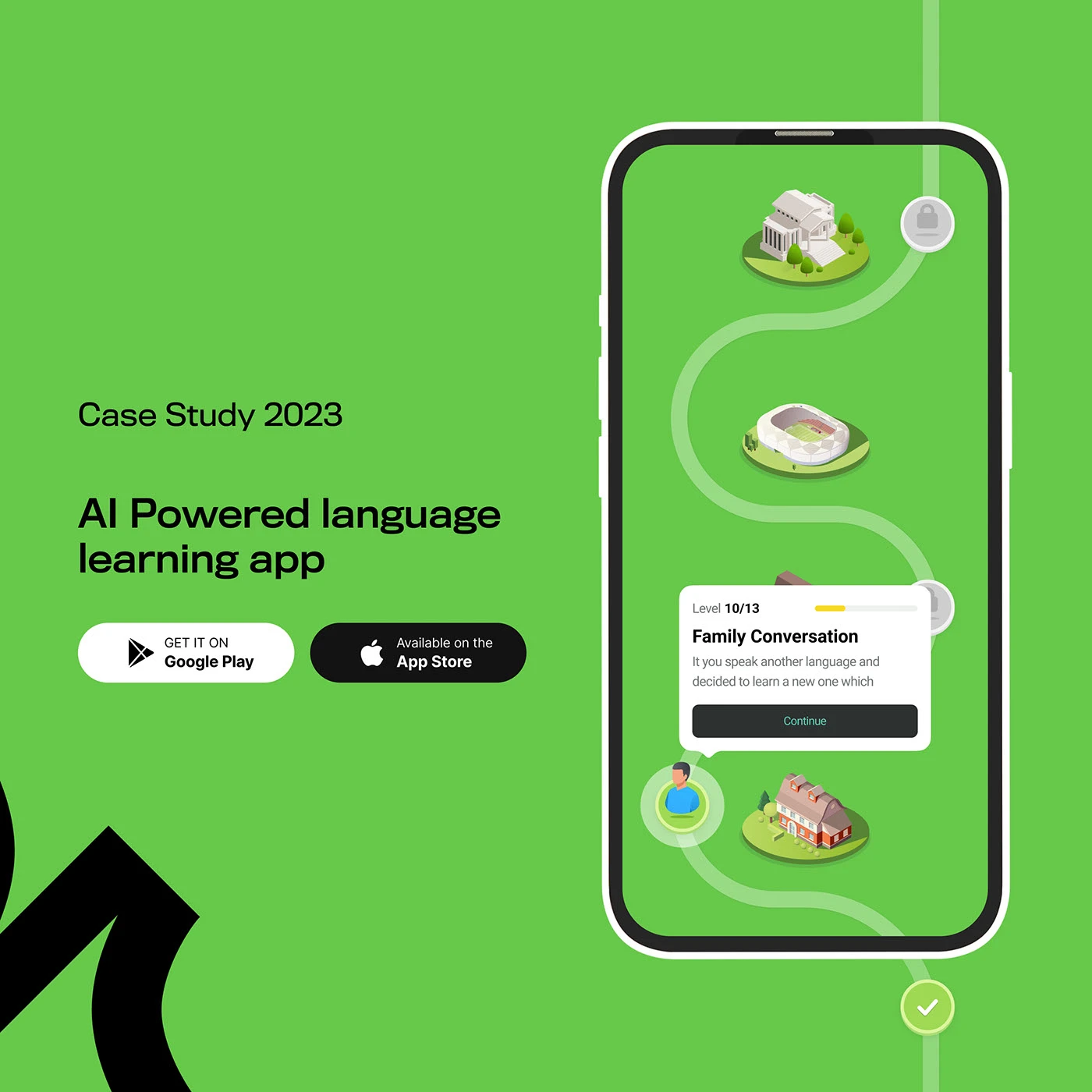
Reading the problem / Dovashi
Learning needs a useful response after each action.
Dovashi connects language-learning UX with a recognizable identity. Visual character should help explain progress and feedback.
Identity, illustration, language content and Material interface conventions need to reinforce the learning task.
How can a learning interface feel culturally familiar while supporting useful practice?
Evidence: the project account and the attributed artifacts on this page. Process drawings and interaction studies are reconstructed explanations; numerical research or business results are included only where separately supported.
02 / Dovashi
My role
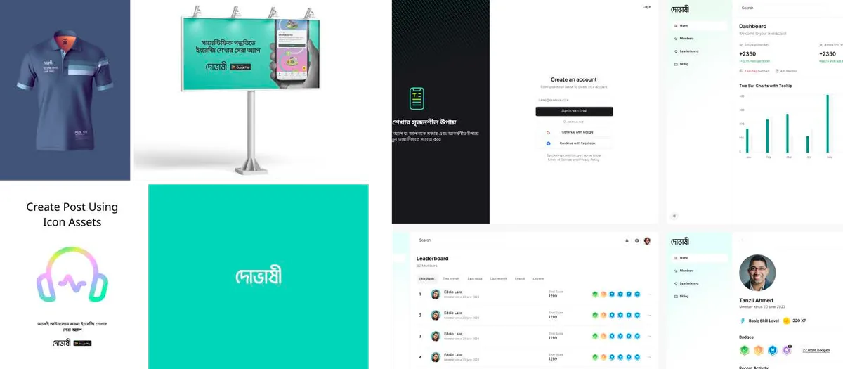
- Built branding — logo, illustrations and icons — for a recognizable identity.
- Applied Material Design for a seamless Android experience.
- Ensured content was accurate and culturally relevant.
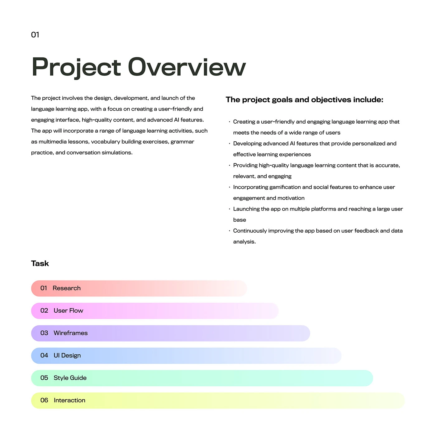
03 / Dovashi
The process
- Developed learner personas and journeys around language practice.
- Explored lessons and feedback through wireframes and prototypes.
- Refined the interface with developers and iterated from user testing and feedback.
The process / Dovashi
A direction.
A way to build it.
The product process connects culturally relevant content, recognizable character and understandable lesson feedback.
A schematic of sequence and overlap, not a dated project schedule.
Understand the learner
Use the documented personas and journeys to frame a language-practice experience.
Structure the activity
Separate learning goals, lesson instructions, responses and progress feedback.
Explore lessons and identity
Bring wireframes, prototypes, Material patterns and illustration into the learning context.
Iterate from feedback
Refine the product with developers and the testing and feedback work described in the source account.
How can a learning interface feel culturally familiar while supporting useful practice?
A learner moves from a goal into practice and then needs to understand what the response means. Progress feedback and corrective feedback have different jobs. Bringing them into one journey connects the brand’s friendly character to the experience of learning.
Journey map / Dovashi
See the whole task in context.
Choose a step to connect the person’s intent with the interface and the design decision.
Current intent
Choose a learning goal
Identity, illustration, language content and Material interface conventions need to reinforce the learning task.
- Interface context
- Learning goal
- Review question
- Does the illustration clarify the lesson or compete with the task?
Representative task sequence and recovery path, not a measured emotional curve or historical research map.
Behind the experience
The visible task depends on work behind it.
For Dovashi, this map connects “Choose a learning goal” to “Review progress”. Read across to follow the task, then select a layer to inspect the interface, design and delivery references behind it.
| Layer | Choose a learning goal | Enter a lesson | Practice a response | Review progress |
|---|---|---|---|---|
| The task | Choose a learning goal | Enter a lesson | Practice a response | Review progress |
| Visible interface | Learning goal | Learning goal | Practice activity | Progress feedback |
| Design checkpoint | Identity, illustration, language content and Material interface conventions need to reinforce the learning task. | Give the learner a clear reason to begin the lesson. | Separate the instruction from the response being practiced. | Explain progress and the opportunity to try again. |
| Implementation reference | Use the documented personas and journeys to frame a language-practice experience. | Separate learning goals, lesson instructions, responses and progress feedback. | Bring wireframes, prototypes, Material patterns and illustration into the learning context. | Refine the product with developers and the testing and feedback work described in the source account. |
| Recovery | Incorrect response → explain the learning point → offer another attempt | |||
A reconstructed delivery map: the implementation row summarizes design-process dependencies, rather than claiming to document the original backend architecture.
A stable lesson hierarchy with selective expression.
Reconstructed comparison of design approaches. These are review studies, not a claim that both directions were historically tested or shipped.
What this direction changes
A stable lesson hierarchy with selective expression
Keeps the learning task clear while retaining a recognizable voice.
Design the lesson around instruction, practice and feedback.
Personas, journeys, wireframes and prototypes appear in the source process. The reconstructed views focus on entering a lesson, practicing a response and reviewing progress. Illustration can support those moments without taking over the instruction or obscuring the next attempt.
01 / Learning goal
Dovashi⌕
01Learning goal↗
02Practice activity↗
03Progress feedback↗
Enter a lesson
Give the learner a clear reason to begin the lesson.
02 / Practice activity
Dovashi⌕
Choose a learning goalLearning goal
Enter a lessonPractice activity ⌄
✓Practice a response
Practice a response
Separate the instruction from the response being practiced.
03 / Progress feedback
Dovashi⌕
Review progress
- Learning goal
- Review
- Practice activity
- Review
Review progress
Explain progress and the opportunity to try again.
Try the interaction
Dovashi / Task & review study
Dovashi01 / 03
View 01
Learning goal
Give the learner a clear reason to begin the lesson.
Keep this context visibleLearning goal
Give the learner a clear reason to begin the lesson.
Starting context
Choose a learning goal
Make language examples unmistakable.
Separate instruction, language examples and progress feedback. Bengali, Arabic and mixed-language content need appropriate direction, line height and wrapping.
Illustrative type-role specimenDovashi
Choose a learning goal.
Review progress.
HeadingPractice activity
24 / 30 px · regularBodyHow can a learning interface feel culturally familiar while supporting useful practice?
16 / 26 px · regularLabelReview progress
12 / 18 px · regularStateIncorrect response → explain the learning point → offer another attempt
12 / 18 px · regularPortfolio-font hierarchy illustration; the source does not establish the exact client font or token scale.
Keep encouragement separate from system feedback.
Does the illustration clarify the lesson or compete with the task?
An illustration should reinforce the lesson or the identity at a useful moment. Decorative character becomes less helpful when it competes with the learner’s instruction.
How should corrective feedback encourage another attempt without resembling a system error?
A wrong answer is part of practice, not necessarily an application failure. Copy and visual feedback should explain what to try next without making those two situations look identical.
Hand off the lesson behavior with the visual language.
The product contribution joins Material interface patterns with identity, illustration and culturally relevant content. Implementation references should show how those pieces meet during a real learning activity, including feedback and another attempt.
A future AI-supported content or interface change needs approved language examples and the relevant activity pattern. Review cultural meaning and directionality as well as visual consistency; a fluent-looking response is not sufficient validation.
The product page examines learning UX; the separate brand film focuses on identity applications and motion.
Accessibility & standards
Access belongs in the design.
For Dovashi, carry accessibility requirements from the core user journey into component states, prototypes and engineering acceptance criteria.
WCAG 2.2 AA · EN 301 549 · APCA · WAI-ARIA · Platform guidance
Read and navigate with assistive technology
Specify accessible names, logical reading order and meaningful control roles. Plan VoiceOver or TalkBack checks, Dynamic Type or text scaling, and platform-appropriate touch targets.
Preserve meaning across themes
Review WCAG 2.2 AA contrast and non-color cues in light and dark appearances; use APCA as an additional typography-readability check.
Respect native behavior
Use Apple HIG and relevant Android guidance for navigation, gestures, focus and motion preferences. Give gesture-driven actions a discoverable alternative.
Review scope & standards references
These are design references and review priorities, not a claim that this historical project passed a WCAG audit. Record criterion-level evidence, assistive-technology and device results, unresolved issues and retest outcomes before making a conformance statement.
APCA supplements the WCAG 2.2 contrast checks; it does not replace them. WCAG 3 remains a draft. EN 301 549 v4.1.1 is the latest published edition checked on 6 November 2026; its publication and its formal EU legal citation are separate matters. Confirm the applicable procurement or legal baseline with the client.
Outcomes & scope
What the work delivers.
- Contributed to 5M users in the first year.
- Achieved 4.4 and 4.3 app-store ratings.
- Secured over $4M in funding.
Results are described within the documented project scope. Illustrative studies are identified separately from original project artifacts.
Review & next iteration
What needs to hold up in use.
Use these questions to review Dovashi against the behavior the design is intended to support.
- 01
Does the learner understand the feedback before moving on?
- 02
Can the same hierarchy accommodate the supported scripts?
Project-specific acceptance questions for a future review, not reported usability-test results.
Reflection / Dovashi
What I’d carry forward.
A recognizable learning product still needs to make the next lesson understandable. Identity, content hierarchy and response to an action should reinforce each other.