No data yet
GhostDataPlaceholder keeps the chart card’s shape: a dashed baseline and a monochrome placeholder curve, a short explanation, and “Check again” only where a real refresh exists.
Reduce Motion stops the draw-in and sheen.
Vital
Vital is my independent iOS app for reading health signals day to day. I designed it and built it in SwiftUI, with Claude and Codex working from one shared set of project rules.
It brings together Apple Health data, things a person logs themselves, calculated wellness scores and an AI coach. Each of those means something different, and the product only works if it never presents one as another.

01The problem
A wellness dashboard looks finished when every card has a number. The trouble is that some of those numbers aren’t known.
Vital combines four kinds of input: measurements from Apple Health, things the person logs themselves, scores the app calculates, and the things it simply doesn’t have yet. A heart-rate reading is an observation. A readiness score is an estimate built on top of observations. A missing night of sleep data is neither, and it is not a zero.
If the interface treats those the same, it starts telling people things that aren’t true: a low score that is really missing data, or a confident AI summary built on an empty day. The design problem was to keep the daily picture useful without making it look more certain than its inputs allow.
The rule I kept coming back to: if Vital doesn’t know something, it should say so, in the same place the number would have been.
02How it was made
Vital is an independent product. There’s no client team; I use AI-assisted prototypes to explore design decisions and review the interaction.
No user interviews, clinical review or team process are implied. Where this page describes a decision, it’s a design rationale from the source and docs.
03Four kinds of information
The core of the information model: every value on screen belongs to exactly one of these, and the interface shows which.
Read from Apple Health, such as heart rate, HRV, sleep stages or workouts.
Shown with its date and source. Never adjusted to look complete.
Logged by the person: habits, journal entries, meals, fasting.
Shown as theirs and editable. An AI meal estimate needs review before it’s saved.
Calculated by the app’s scoring layer, such as readiness, strain or stress.
Optional by design. If the inputs aren’t there, there’s no score.
Not shared, not synced yet, or not recorded for this day.
An explicit “—” or a no-data card with a reason and, where it exists, a real retry.
Information model drawn for this case study from the scoring, persistence and audit sources. It’s an explanatory diagram, not a project artifact.
04Consent to action
Consent comes first, and every later step can end in “not enough data” without breaking.
Flow reconstructed for this case from the onboarding, scoring and summary sources. It explains the behavior; it isn’t an original flow file.
05Real screens
Real screens from the app, most of them captured in the iOS Simulator with no Apple Health history: exactly when honest states matter.

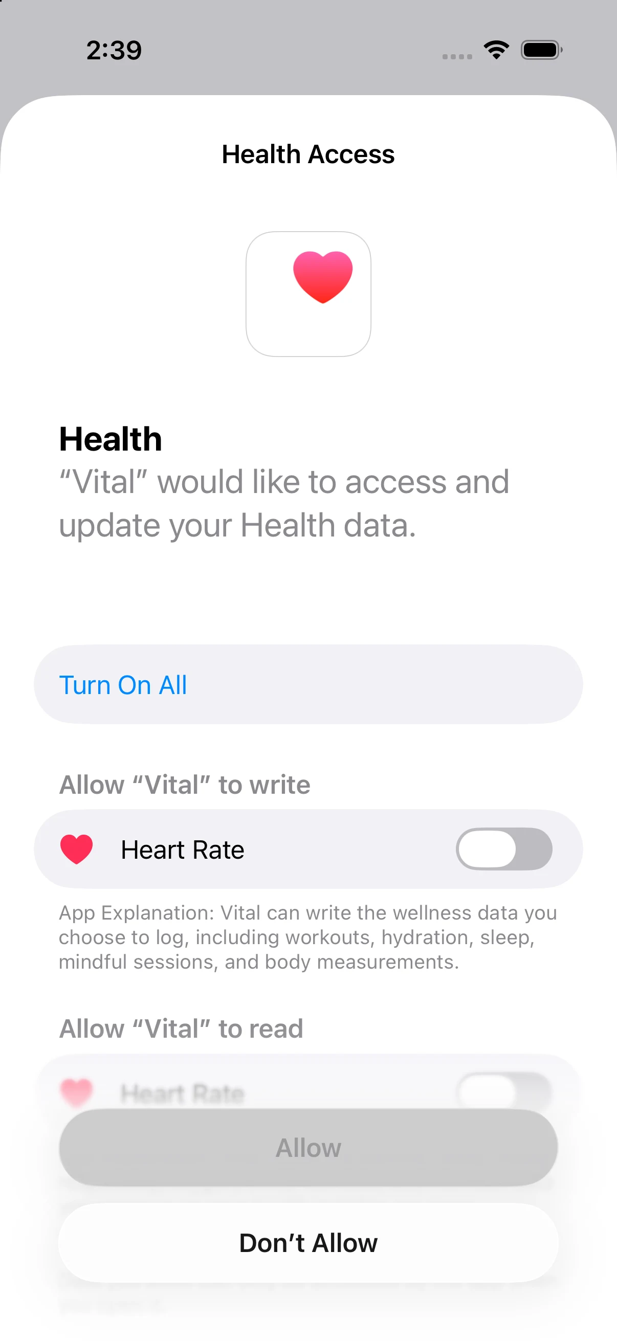
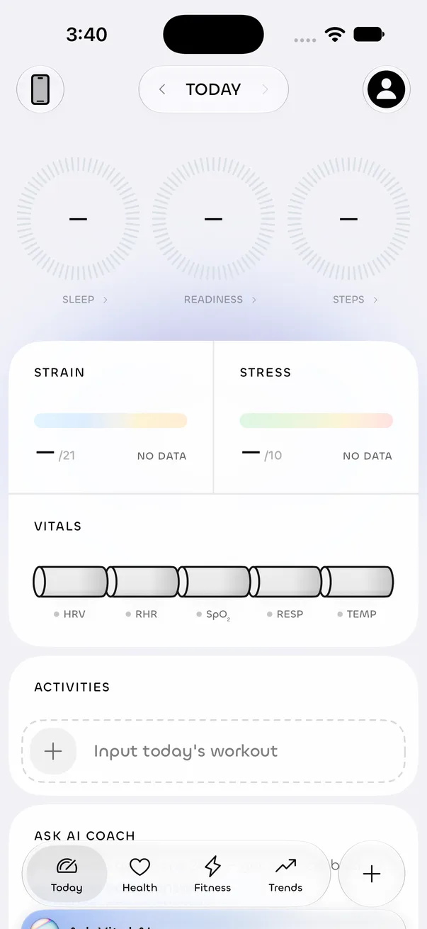
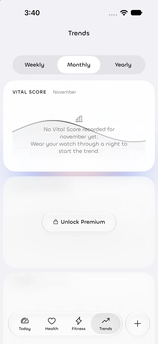
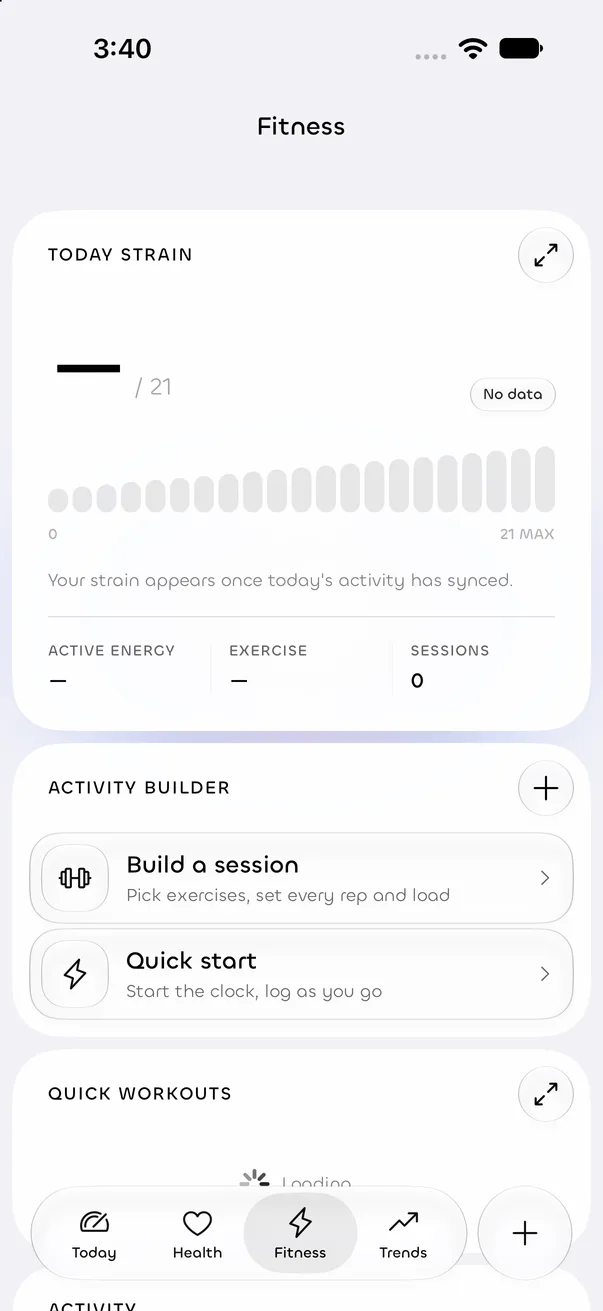
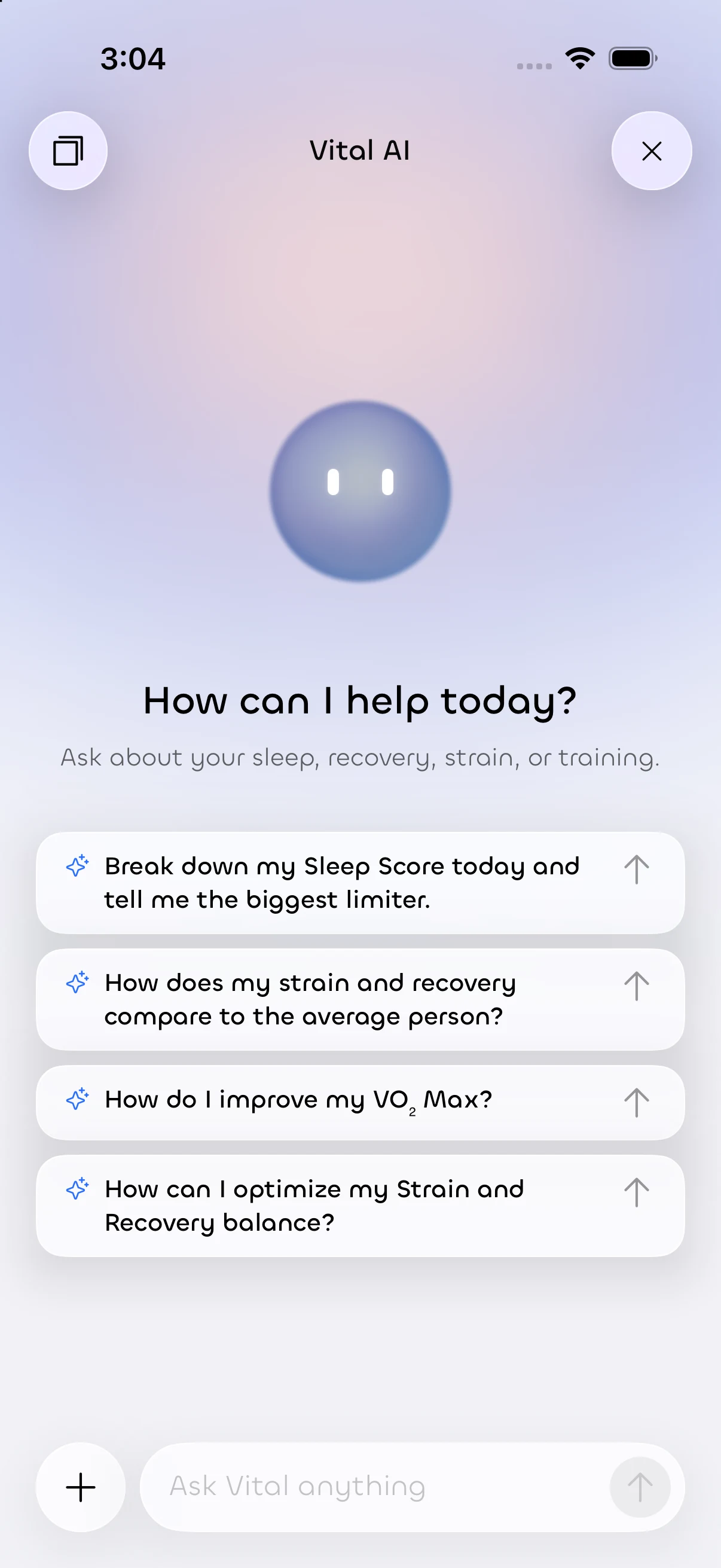
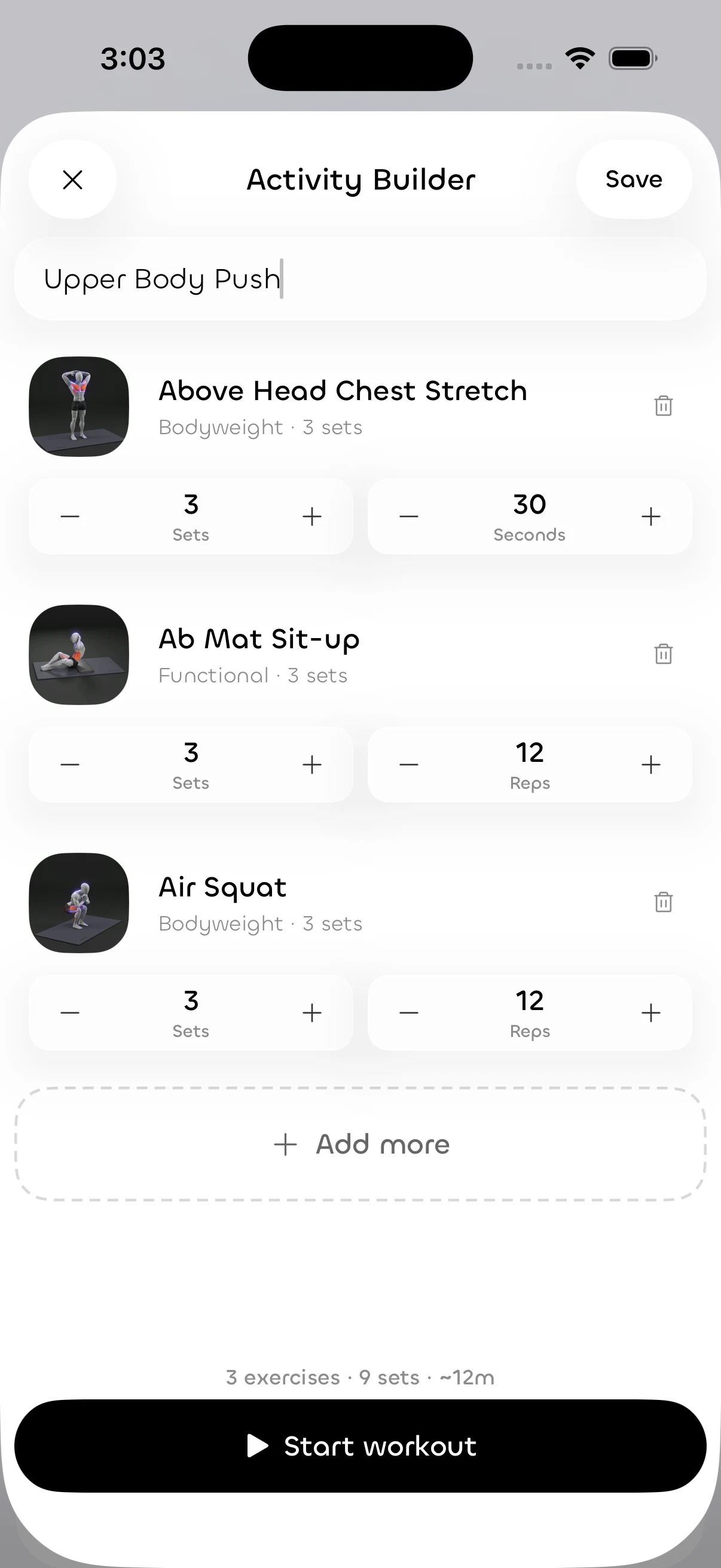
Simulator captures from a Debug build (iPhone 18 Pro) using the project’s documented simulator sign-in bypass, with no HealthKit data. The other three are earlier reviewed app captures. Empty and permission states are shown on purpose; no health readings are presented as results.
06Removing invented data
The most important design work on Vital was taking numbers away.
An audit of every shipping screen traced each displayed value back to its source. A number of surfaces were showing values that looked like the person’s data but weren’t: preview defaults, card-local formulas and timers that only looked like progress. Each one was replaced with a real source, or with an honest empty state.
| Surface | Before | After |
|---|---|---|
| Biological age card | A preview default (39.7, “5.5 years older”) appeared as the person’s result. | Reads the real aging assessment, or shows nothing to report. |
| Daily Readiness & Sleep | Card-level formulas such as sleep ÷ 8 h disagreed with Today. | One scoring layer for every surface; “--” when there’s no score. |
| Onboarding | Fixed 2 s and 6.2 s timers ticked checkmarks unrelated to any work. | Waits for real ingestion to settle and recalculates; times out honestly. |
| Daily Journal | A fixed 1/4 completion ring. | Counts the person’s active habits; with none, invites them to add one. |
| Steps distance | Estimated as steps × 0.000762. | Apple Health walking distance, or “—”. |
| AI daily summary | Missing recovery, sleep and strain were passed in as real zeros. | Missing values are marked unavailable, and the summary only uses scores that exist. |
Before and after examples taken from the project’s mock-data audit. Debug-only demo tools remain, but they’re excluded from Release builds.
07The design system
Vital’s design system lives in code. The documentation is written so a person or an AI tool composes from it instead of inventing.
56
Today
Sleep last night
Your curve draws as soon as samples sync.
SOURCE · APPLE HEALTH
10 · 12 · 14 · 16 · 22 · 34 · 56 pt
Specimen set in Space Grotesk, Vital’s alternative family; Chillax, the default, is visible in the app captures. Sizes follow the documented ramp.
Before writing a new view, the docs ask for a 60-second reuse audit: does a component exist, is there a card to borrow from, is the pattern documented, is there a token for this number, and is this the third copy? If so, extract it.
08Components & states
Three recipes from the design-system docs carry most of the “honest state” work.
GhostDataPlaceholder keeps the chart card’s shape: a dashed baseline and a monochrome placeholder curve, a short explanation, and “Check again” only where a real refresh exists.
Reduce Motion stops the draw-in and sheen.
Optimal, Watch and Needs attention come from one enum that provides both the tint and the label, so status never depends on color alone.
Hand-rolled colored capsules aren’t allowed.
An entry card shows exactly one filled primary action and one quieter secondary, and they change with state: “Build a workout” / “Quick start” becomes “Start workout” / “Save”.
Emphasis comes from fill and weight, never from hue.
Illustrative specimens of the documented recipes, drawn for this page; not the SwiftUI components themselves.
09The AI boundary
“Private AI” is easy to promise. Vital has two AI routes, and the interface needs to be accurate about both.
Requests go through a fixed set of validated, read-only tools that return aggregates with bounded inputs, not the whole health record.
Uses Apple’s on-device model where it’s available, with a fallback. Missing values are labelled as missing in the prompt.
Only runs when the person taps Estimate; the result is a draft to review before saving.
So the copy never says all AI stays on the device. Chat sends the requested aggregates to a cloud model, and guidance is wellness information, not medical advice.
10Design decisions
Each of these is a trade-off I chose on purpose.
A missing score stays empty instead of defaulting to 0. It costs more empty-state design, but a low result and an absent one can never be confused.
Card surfaces stay neutral, so color only appears where it says something about a metric. It’s quieter, and status still carries a text label.
Seven sizes and two weights. It limits expression, but it makes every screen, including AI-written ones, land on the same hierarchy.
A workout draft is editable prescription until a real session is recorded with live heart rate and energy. Manual save is a fallback, not the default.
Onboarding takes as long as the data does, up to a timeout, rather than playing a timed animation that suggests work is happening.
11Accessibility
WCAG 2.2 AA is the reference for contrast and non-color cues, alongside Apple’s Human Interface Guidelines for native behavior; APCA is a supplementary readability check.
Based on the source and design-system rules. No VoiceOver audit, user testing or formal conformance review is claimed.
12Handoff & maintenance
Here the “handoff” is between sessions and tools. The repo is set up so any tool picks up the same rules.
The data layer keeps the same promise: records the person creates sync through private CloudKit, while the bookkeeping for reading Apple Health stays local to each device. One scoring layer publishes optional values that every surface reads.
13Scope & boundaries
Vital is not clinically validated, and its scores are wellness estimates, not medical measurements. There are no adoption, revenue or speed figures here. Direct Oura, WHOOP, Garmin, Fitbit or Withings connections aren’t available; those devices can share through Apple Health. Some audit items, such as interrupted-workout recovery, are still open.
A calm interface earns trust by showing the limits of what it knows. On Vital, the empty states took more design than the full ones, and they were worth it.