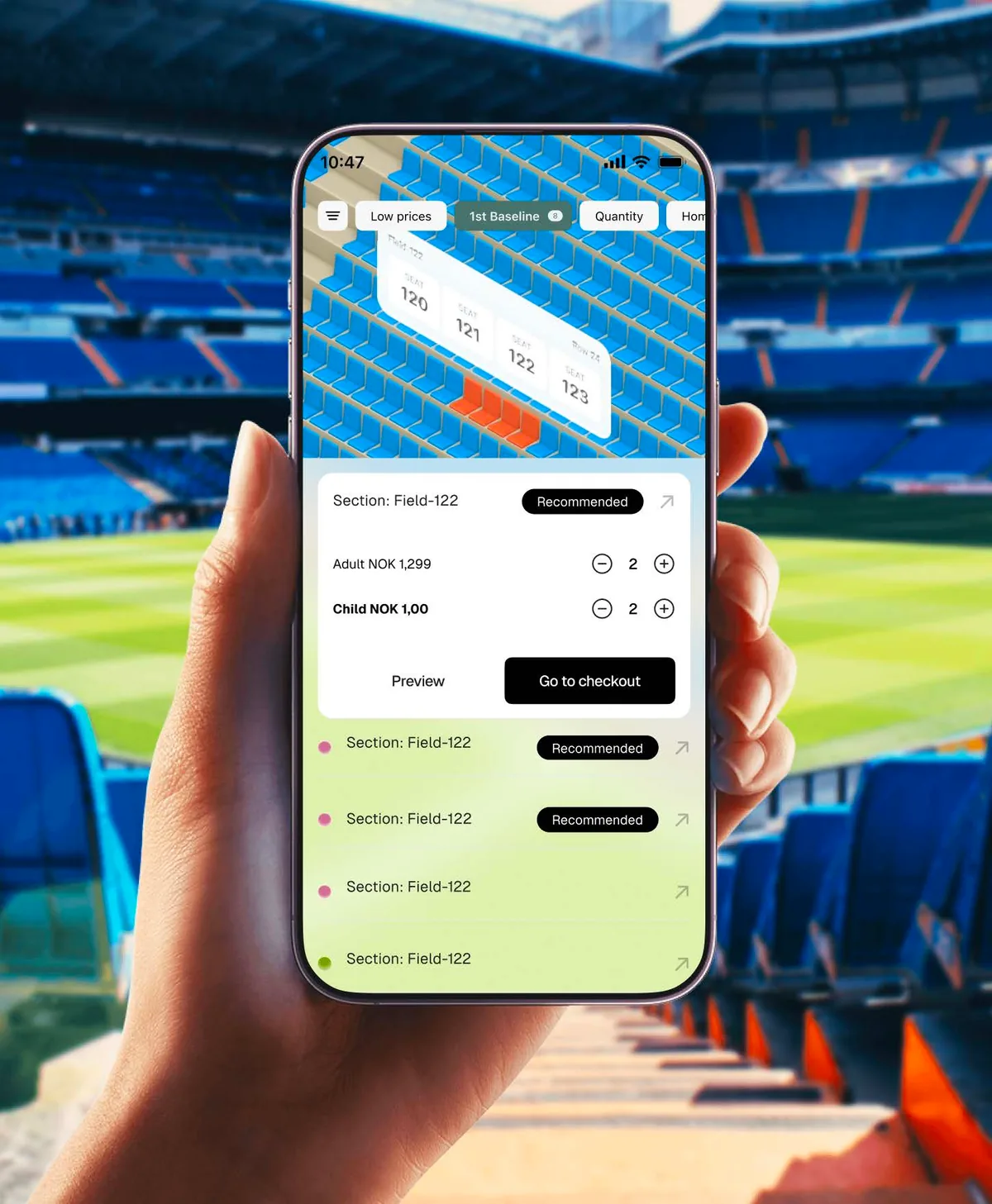
TicketCo / Original product presentation
01 / TicketCo
The problem
- A dated UI that failed to feel intuitive.
- Manual-heavy dashboards created routine inefficiency.
- Not optimized for mobile, limiting accessibility.
- Rigidity made ticketing operations hard to manage.

Reading the problem / TicketCo
An organizer’s operation crosses page boundaries.
Event context needs to remain recognizable while an organizer inspects data, configures an action and reviews its consequences.
The product account focuses on organizer tasks and responsive event-management surfaces; the separate core-system story explains their reusable implementation foundations.
How can organizers act on dense operational information without losing their place?
Evidence: the project account and the attributed artifacts on this page. Process drawings and interaction studies are reconstructed explanations; numerical research or business results are included only where separately supported.
02 / TicketCo
My role
- Redesigned the entire system to Tailwind guidelines for seamless dev handoff.
- Introduced mobile-friendly, streamlined dashboards.
- Designed an AI ticketing assistant and bulk-action “tap” solution.
- Explored consumer AR to enrich ticket-buying.
03 / TicketCo
The process
- Audited the existing platform and workflows.
- Wireframes, prototypes and a component system.
- Iterated with engineering on a Tailwind-based handoff.

The process / TicketCo
A direction.
A way to build it.
This process follows the organizer’s operation; the separate core-library case explains the system supporting it.
A schematic of sequence and overlap, not a dated project schedule.
Review organizer friction
Audit the dated interface, manual-heavy dashboards and limited mobile experience described in the portfolio record.
Preserve event context
Frame the path from an event overview to an operation and its review state.
Explore the responsive task
Use wireframes and prototypes to make the same operation understandable with different amounts of screen space.
Connect flow and handoff
Carry the task sequence into the Tailwind-oriented engineering reference and implementation review.
How can organizers act on dense operational information without losing their place?
The product story starts with an organizer trying to complete work, not with the library that supports it. Event context, operational data and the next action need to remain connected. The design-system case study explains the reusable foundations; this page follows the task those foundations support.
Journey map / TicketCo
See the whole task in context.
Choose a step to connect the person’s intent with the interface and the design decision.
Current intent
Choose an event
The product account focuses on organizer tasks and responsive event-management surfaces; the separate core-system story explains their reusable implementation foundations.
- Interface context
- Event overview
- Review question
- Which legacy actions must remain directly accessible to experienced organizers?
Representative task sequence and recovery path, not a measured emotional curve or historical research map.
Behind the experience
The visible task depends on work behind it.
For TicketCo, this map connects “Choose an event” to “Review & confirm”. Read across to follow the task, then select a layer to inspect the interface, design and delivery references behind it.
| Layer | Choose an event | Review ticketing data | Configure an action | Review & confirm |
|---|---|---|---|---|
| The task | Choose an event | Review ticketing data | Configure an action | Review & confirm |
| Visible interface | Event overview | Event overview | Action workspace | Review changes |
| Design checkpoint | The product account focuses on organizer tasks and responsive event-management surfaces; the separate core-system story explains their reusable implementation foundations. | Anchor the operation to the selected event. | Keep the actionable information close to the configuration. | Make the proposed change understandable before confirmation. |
| Implementation reference | Audit the dated interface, manual-heavy dashboards and limited mobile experience described in the portfolio record. | Frame the path from an event overview to an operation and its review state. | Use wireframes and prototypes to make the same operation understandable with different amounts of screen space. | Carry the task sequence into the Tailwind-oriented engineering reference and implementation review. |
| Recovery | Incomplete configuration → explain the missing field → return to the action | |||
A reconstructed delivery map: the implementation row summarizes design-process dependencies, rather than claiming to document the original backend architecture.
Operation-first navigation.
Reconstructed comparison of design approaches. These are review studies, not a claim that both directions were historically tested or shipped.
What this direction changes
Operation-first navigation
Keeps the task and event visible as the workspace changes.
Keep the event visible through the operation.
The published process includes an audit, wireframes, prototypes and component work. This reconstruction compares an event overview with an action workspace and a review surface. The point is continuity: organizers should not have to rediscover which event or operation they are editing.
01 / Event overview
TicketCo⌕
01Event overview↗
02Action workspace↗
03Review changes↗
Review ticketing data
Anchor the operation to the selected event.
02 / Action workspace
TicketCo⌕
Choose an eventEvent overview
Review ticketing dataAction workspace ⌄
✓Configure an action
Configure an action
Keep the actionable information close to the configuration.
03 / Review changes
TicketCo⌕
Review & confirm
- Event overview
- Review
- Action workspace
- Review
Review & confirm
Make the proposed change understandable before confirmation.
Try the interaction
TicketCo / Task & review study
TicketCo01 / 03
View 01
Event overview
Anchor the operation to the selected event.
Keep this context visibleEvent overview
Anchor the operation to the selected event.
Starting context
Choose an event
Make the next operational decision readable.
Public Sans is visible in TicketCo’s linked typography board. For the organizer experience, the important distinction is between event identity, operational information and the next action. The separate desktop and mobile heading roles support that reading order on different screen sizes.
Documented families / Public SansTicketCo
Choose an event.
Review & confirm.
HeadingAction workspace
24 / 30 px · regularBodyHow can organizers act on dense operational information without losing their place?
16 / 26 px · regularLabelReview & confirm
12 / 18 px · regularStateIncomplete configuration → explain the missing field → return to the action
12 / 18 px · regularPublic Sans is verified in the original Figma typography board; these role samples use an illustrative scale.
TicketCo core library on Figma ↗Balance organizer familiarity with a clearer product.
Through Cefalo, the TicketCo product work connected Norwegian management and stakeholders, cross-functional colleagues in Ukraine, and developers in Dhaka. In this organizer-flow account, the collaboration question is how an operational requirement reaches a reviewed interface. The core-system account describes how reusable patterns support that translation.
Which legacy actions must remain directly accessible to experienced organizers?
An audit can distinguish an outdated presentation from a still-useful workflow. The redesign should preserve the latter while improving how someone locates and understands it.
Which patterns can web and native experiences share, and where should platform behavior differ?
Mobile layouts cannot simply compress a desktop dashboard. They need to preserve task context and the critical action when less information can be shown at once.
Translate an organizer’s task into buildable states.
The product record includes responsive dashboards and a Tailwind-oriented handoff. Linking the task sequence to the component and state specifications gives engineering a reason for the layout decisions, rather than only a target screenshot.
The wider TicketCo work includes Claude and Codex preparation. When maintaining an organizer flow, the task brief should point to both its product context and the current core-library reference.
The product-flow account complements the core-system story; reservation and AI allocation experiments are documented separately as prototypes.

Accessibility & standards
Access belongs in the design.
For this ticketing experience, prioritize seat-selection alternatives, availability announcements, reservation time limits and recovery without losing a selection.
WCAG 2.2 AA · EN 301 549 · APCA · WAI-ARIA · Platform guidance
Complete the task without a mouse
Define tab order, visible and unobscured focus, named controls, table relationships and error recovery using native semantics and WAI-ARIA patterns.
Understand every state
Pair color with text or icons for selection, warnings and availability. Review text at WCAG contrast thresholds and use APCA alongside font size and weight for readability decisions.
Keep the workflow usable
Review zoom and reflow, 24 × 24 CSS-pixel minimum targets or qualifying spacing, alternatives to dragging, validation and accessible authentication where applicable.
Review scope & standards references
These are design references and review priorities, not a claim that this historical project passed a WCAG audit. Record criterion-level evidence, assistive-technology and device results, unresolved issues and retest outcomes before making a conformance statement.
APCA supplements the WCAG 2.2 contrast checks; it does not replace them. WCAG 3 remains a draft. EN 301 549 v4.1.1 is the latest published edition checked on 6 November 2026; its publication and its formal EU legal citation are separate matters. Confirm the applicable procurement or legal baseline with the client.
Outcomes & scope
What the work delivers.
- Dashboards redesigned to cut routine manual steps for organizers; no measured time saving is claimed.
- A modernized, mobile-ready experience across organizer and buyer flows.
- More flexible ticketing operations, documented in full in the TicketCo 2.0 design-system case study.
Results are described within the documented project scope. Illustrative studies are identified separately from original project artifacts.
Review & next iteration
What needs to hold up in use.
Use these questions to review TicketCo against the behavior the design is intended to support.
- 01
Does the review state identify which event and configuration will change?
- 02
Can an organizer return from a detail view without reconstructing their place?
Project-specific acceptance questions for a future review, not reported usability-test results.
Reflection / TicketCo
What I’d carry forward.
The dashboard is one view of an organizer’s work. Following the operation across screens gives a more useful basis for decisions than optimizing each page in isolation.