Personal and organisational navigation
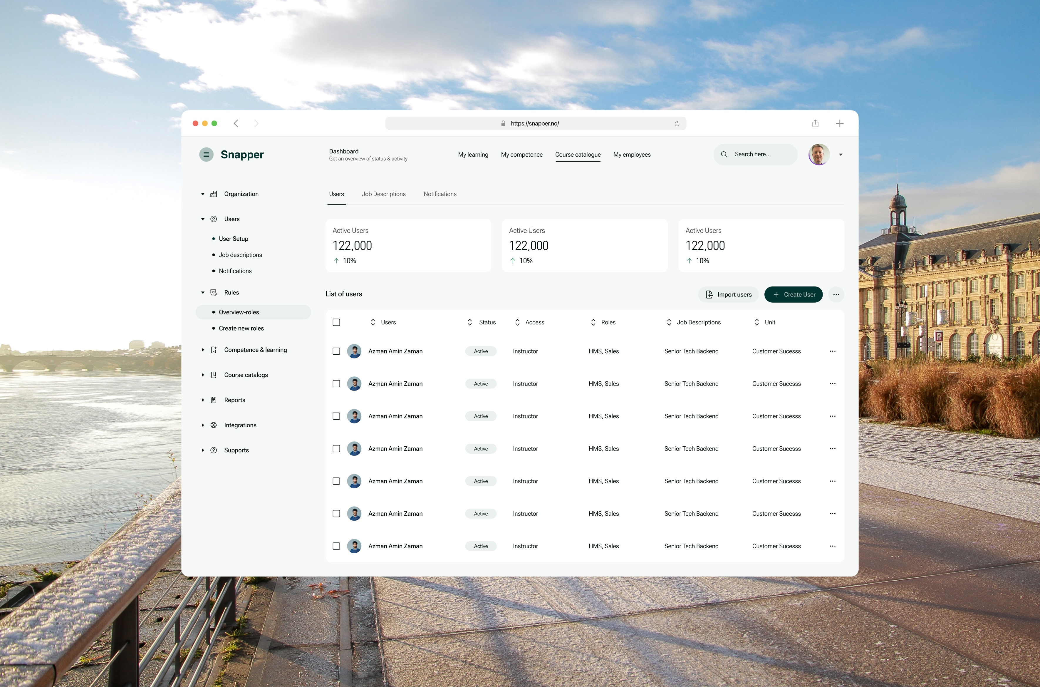
The top bar follows the person; the side navigation follows the organisation. Neither audience has to dig through the other’s tools.
Snapper
Snapper is a Norwegian platform for corporate learning and competence. Through Cefalo, I designed its product UX/UI and managed the client’s Figma component library on Ant Design.
One product serves two very different people: an employee who wants to know what to learn next, and an administrator running users, roles, courses and competence for a whole organisation. The work was keeping both oriented: clear learner screens on desktop and phone, a structured admin side, and one themed component library underneath.
Three courses are due this month.
01The problem
Learning at work has two audiences who need very different things from the same screens.
Employees want to see what they have to learn, what they’ve finished and what’s next. Managers want that picture for their team.
Administrators run everything behind it: users and groups, job descriptions, roles and what each role must know, courses, reports and integrations. When both live in one product, the risk isn’t missing features. It’s people losing their place.
Before drawing screens, we separated what each audience was actually trying to do.
02Two journeys
Mapping the two journeys side by side showed where they meet and where they must stay apart.
The learner’s journey is about today. The administrator’s is about everyone, over time.
That split became the backbone of the navigation.
03Structure
The structure separates what’s yours from what belongs to the organisation.
Two navigation layers do different jobs. The top bar follows the person: their learning, their competence, the course catalogue and, for managers, their employees. The left navigation follows the organisation: users, roles, competence, courses, reports and integrations.
The user list carries the most weight. Each row shows the person, their status, access level, roles, job description and unit, with sortable columns, bulk selection and two clear actions at the top: import users, or create one. Status is a labelled chip, not just a colour.
Navigation and labels read from the project presentation. The user rows in that image are repeated placeholder data.
With the structure settled, the next question was how much to build, and how much to borrow.
04Starting from Ant Design
Ant Design gives a data-heavy admin product a lot for free: tables, forms, filters and pickers that engineers already know. The work was deciding, component by component, how far to go from the default.
Use the component as is.
Tables, pagination, date pickers and form controls, where people expect standard behavior.
Keep the component, change the tokens.
Colour, type, radius and spacing tuned to Snapper, so the product doesn’t look like an Ant Design demo.
Compose framework parts.
A user row with avatar, status chip, access level, roles and job description.
Design what the framework lacks.
Only where learning and competence need it, then documented as a new component.
The working method used for the library. Token values and component counts stay in the private client file.
A themed foundation meant the learner screens could focus on clarity instead of controls.
05The learner experience
The learner home answers one question first: what should I do now?
A greeting and a single line about what’s due set the context before anything else.
Assigned courses come first, each with a progress ring and one action: Continue.
Three courses are due this month.
Basics for every manager in the business.
A half-circle gauge shows how far through this year’s plan someone is, with completed, in-progress and not-started counts beside it.
Inside a course, modules show done, current and upcoming states, and a single button resumes where the learner left off.
Three courses are due this month.
Live screens redesigned from the Snapper Figma file. Names, courses and values are placeholders.
Courses only matter because roles require them, so competence needed its own view.
06Competence
People should see what their role requires and where they stand, without asking an administrator.
The competence view groups requirements by area, shows tasks completed against tasks required, and marks an area complete in words, not only colour. The same structure sits on desktop, where the learner home places it next to assigned courses and recommendations.
Behind every one of those numbers is an administrator keeping the organisation’s data in order.
07The admin side
The admin side is where Ant Design’s tables, filters and forms earn their place.
The top bar follows the person; the side navigation follows the organisation. Neither audience has to dig through the other’s tools.
“Active” is written, not just coloured, so status survives colour blindness and greyscale exports.
Bringing existing staff in is a common first task, so importing users is as visible as creating one.
Keeping Ant Design’s behavior and changing its tokens kept the build fast and the product recognisably Snapper.
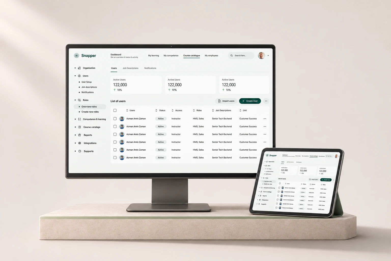
Most of the remaining work wasn’t new screens. It was states.
08Components & states
Most of the library work is in states. These are the kinds a dense admin product has to cover.
Representative states drawn for this page from the confirmed scope. The private component specifications aren’t reproduced here.
Every one of those states had to stay usable for everyone.
09Accessibility
WCAG 2.2 AA is the target, with APCA as a supplementary readability check. Ant Design brings keyboard support and ARIA; theming must not undo it.
Design targets, not audit results. No formal conformance review is claimed.
And everything had to reach engineering exactly as designed.
10Handoff
Handoff for an admin product is mostly about edge cases.
Adopt, theme, extend or build tells engineers whether to use Ant Design as is, change tokens, compose parts or write something new.
Long names, many roles and empty filters are drawn, not just the tidy example row.
A component is ready when its empty, error, loading and selected states exist.
Briefs name the client and library first, so patterns from other clients never leak in.
For AI-assisted work, the brief loads only Snapper’s brand and component references, so Claude or Codex can’t borrow another client’s rules or content.
Looking back, the lesson was less about components than about orientation.
11Outcome & reflection
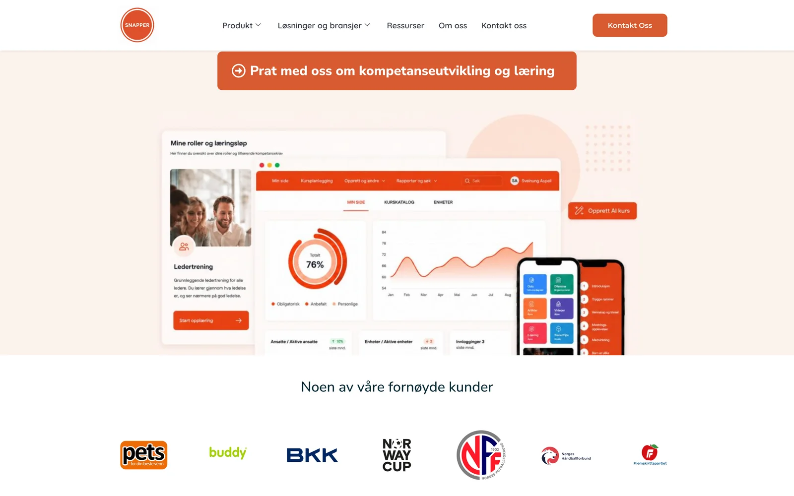
No usage, completion or efficiency figures are claimed. Values in the live screens and the admin presentation are placeholders, and the public website is context.
I started by trying to fit a lot of functionality into one product. What mattered more was that nobody ever wondered where they were, whose data they were looking at, or what to do next.
In an admin product, good design is mostly orientation.