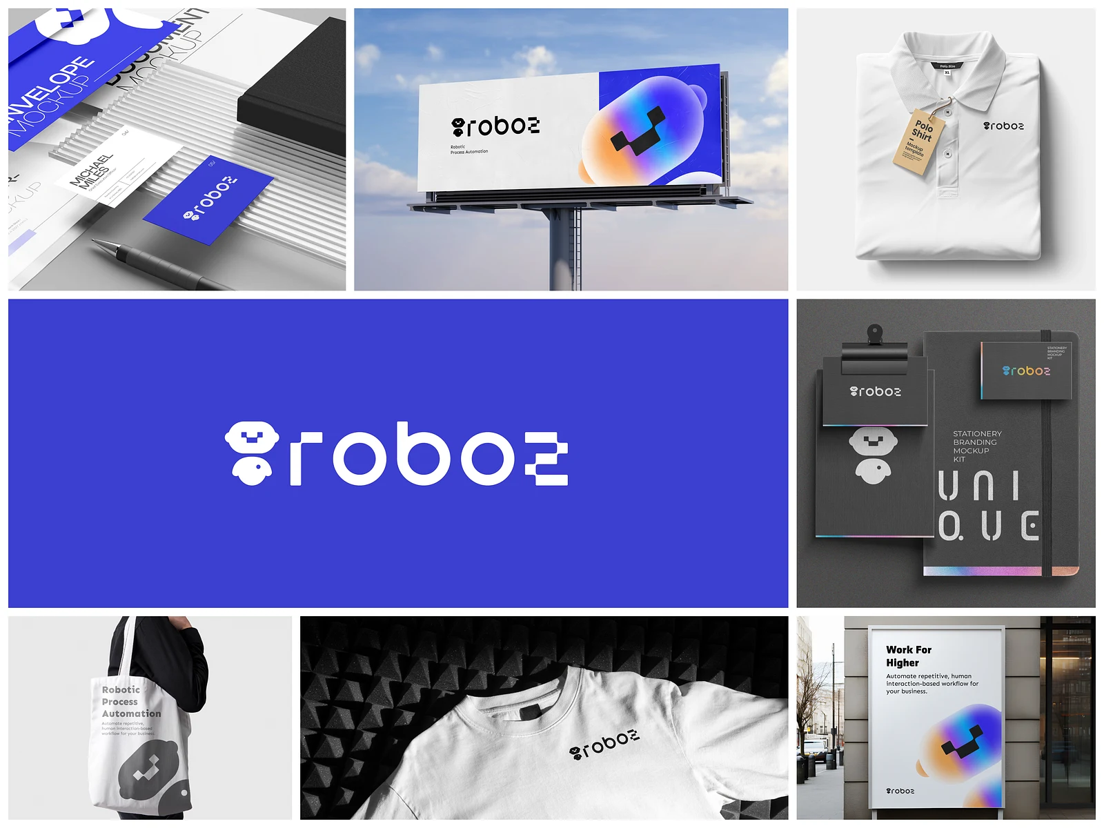
Robo2mation / Original identity presentation
01 / Robo2mation
The context
A published identity exploration for an AI automation brand. Custom typography and a robot-inspired mark make the brand recognizable across its visual applications.
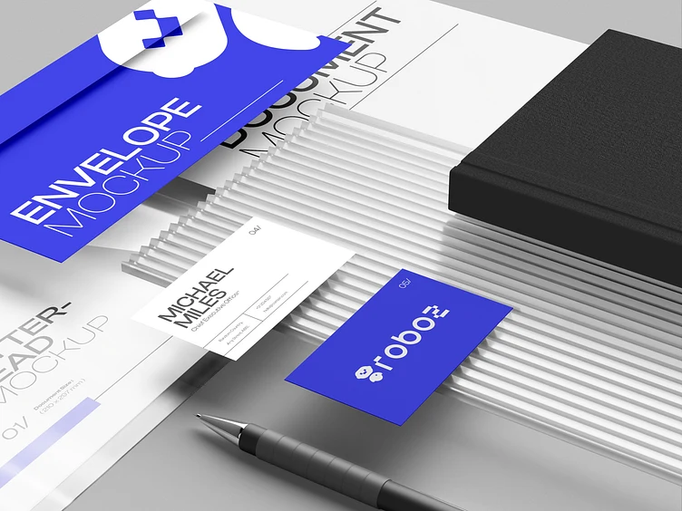
Reading the problem / Robo2mation
Recognition should hold beyond a logo reveal.
The original identity presentation includes the mark and applications. The case concerns visual character across those uses.
The published work establishes a robot-inspired mark, custom typographic character and identity applications; it does not document a full software product.
How can an automation identity be recognizable without relying on generic AI imagery?
Evidence: the project account and the attributed artifacts on this page. Process drawings and interaction studies are reconstructed explanations; numerical research or business results are included only where separately supported.
02 / Robo2mation
The design focus
- Logo and typographic character
- A visual identity around automation
- Brand presentation and applications
The process / Robo2mation
A direction.
A way to build it.
The identity exploration moves from recognizable forms to applications that preserve the mark’s character.
A schematic of sequence and overlap, not a dated project schedule.
Define the recognizable idea
Connect the automation theme with a robot-inspired mark and custom wordmark character.
Separate fixed and flexible elements
Distinguish the approved forms from supporting imagery and layout treatments.
Explore identity applications
Test how the mark and name lead compositions at different scales.
Review recognition
Check a compact use and a larger application before extending the visual reference set.
How can an automation identity be recognizable without relying on generic AI imagery?
Robo2mation’s identity exploration links a robot-inspired mark with custom typographic character and applications. The sequence needs to show how those elements reinforce one another. An automation identity becomes more distinctive when its recognition does not rely entirely on a familiar technology motif.
Journey map / Robo2mation
See the whole task in context.
Choose a step to connect the person’s intent with the interface and the design decision.
Current intent
Identify the idea
The published work establishes a robot-inspired mark, custom typographic character and identity applications; it does not document a full software product.
- Interface context
- Mark construction
- Review question
- Which visual features make the mark recognizable at small sizes?
Representative task sequence and recovery path, not a measured emotional curve or historical research map.
Behind the experience
From composition to a consistent deliverable.
For Robo2mation, this map connects “Identify the idea” to “Apply the identity”. Read across to follow the task, then select a layer to inspect the interface, design and delivery references behind it.
| Layer | Identify the idea | Introduce the mark | Show typographic character | Apply the identity |
|---|---|---|---|---|
| The task | Identify the idea | Introduce the mark | Show typographic character | Apply the identity |
| Visible interface | Mark construction | Mark construction | Wordmark character | Identity application |
| Design checkpoint | The published work establishes a robot-inspired mark, custom typographic character and identity applications; it does not document a full software product. | Inspect the recognizable features of the symbol. | Give the custom name treatment its own visual role. | Check whether the identity still leads the application. |
| Implementation reference | Connect the automation theme with a robot-inspired mark and custom wordmark character. | Distinguish the approved forms from supporting imagery and layout treatments. | Test how the mark and name lead compositions at different scales. | Check a compact use and a larger application before extending the visual reference set. |
| Recovery | Application loses recognition → return to the approved mark and proportions | |||
A reconstructed delivery map: the implementation row summarizes design-process dependencies, rather than claiming to document the original backend architecture.
An identity tested across contexts.
Reconstructed comparison of design approaches. These are review studies, not a claim that both directions were historically tested or shipped.
What this direction changes
An identity tested across contexts
Shows how the mark’s character survives different compositions.
Test the mark, the wordmark and the application separately.
The reconstructed composition studies isolate mark construction, typographic character and identity usage. Each answers a different question: what is recognizable, how the name carries personality and whether the identity remains coherent when placed in a larger layout.
01 / Mark construction
Robo2mationIdentify the idea
OpeningResolve
Introduce the mark
Inspect the recognizable features of the symbol.
02 / Wordmark character
Robo2mationShow typographic character
OpeningResolve
Show typographic character
Give the custom name treatment its own visual role.
03 / Identity application
Robo2mationApply the identity
OpeningResolve
Apply the identity
Check whether the identity still leads the application.
Try the interaction
Robo2mation / Composition study
Robo2mation01 / 03
View 01
Mark construction
Inspect the recognizable features of the symbol.
Robo2mationIdentify the idea✳
Starting context
Identify the idea
The wordmark is a designed form, not a body font.
Custom logo typography is part of the identity. Supporting body typography should stay distinct from the wordmark; the exact supporting font family is not established here.
Illustrative type-role specimenRobo2mation
Identify the idea.
Apply the identity.
HeadingWordmark character
24 / 30 px · regularBodyHow can an automation identity be recognizable without relying on generic AI imagery?
16 / 26 px · regularLabelApply the identity
12 / 18 px · regularStateApplication loses recognition → return to the approved mark and proportions
12 / 18 px · regularPortfolio-font hierarchy illustration; the source does not establish the exact client font or token scale.
Find the boundary between character and clutter.
Which visual features make the mark recognizable at small sizes?
A small-scale mark needs a recognizable silhouette before additional presentation detail is useful. The identity should not depend on seeing every decorative feature at full size.
How much visual character can an application add before it competes with the identity?
Applications can reinforce the automation idea without competing with the mark. More visual character is not always a stronger hierarchy when the identity is already expressive.
Separate identity assets from presentation treatments.
The public work establishes the original identity imagery and applications. A reusable package should distinguish the mark and wordmark from the supporting composition, allowing future usage to preserve recognition without treating every presentation effect as a mandatory brand element.
A proposed AI-assisted identity application should begin with the existing artwork, not a request to redraw or approximate the logo. Review the relative prominence of mark, name and supporting content before extending the visual system.
The published project supports an identity-design story; it does not document the capabilities or launch of a software product.
Accessibility & standards
Access belongs in the design.
For Robo2mation, carry accessibility requirements from the core user journey into component states, prototypes and engineering acceptance criteria.
WCAG 2.2 AA · EN 301 549 · APCA · WAI-ARIA · Platform guidance
Turn the palette into usable roles
Document approved text/background combinations for body text, large text and UI components. Assess functional content against WCAG 2.2 AA; use APCA to refine type size and weight.
Carry identity without losing meaning
Provide non-color cues, readable type hierarchy and accessible template reading order. Review captions and a reduced-motion alternative for product films and animated applications.
Make the rules usable in production
Include accessible color tokens, component states and content guidance in designer, developer and Claude/Codex references. Logo presentation alone does not establish interface accessibility.
Review scope & standards references
These are design references and review priorities, not a claim that this historical project passed a WCAG audit. Record criterion-level evidence, assistive-technology and device results, unresolved issues and retest outcomes before making a conformance statement.
APCA supplements the WCAG 2.2 contrast checks; it does not replace them. WCAG 3 remains a draft. EN 301 549 v4.1.1 is the latest published edition checked on 6 November 2026; its publication and its formal EU legal citation are separate matters. Confirm the applicable procurement or legal baseline with the client.
Outcomes & scope
What the work delivers.
- Original identity imagery from my published Dribbble project.
Results are described within the documented project scope. Illustrative studies are identified separately from original project artifacts.
Review & next iteration
What needs to hold up in use.
Use these questions to review Robo2mation against the behavior the design is intended to support.
- 01
Does the mark remain recognizable at a smaller display size?
- 02
Do application layouts preserve its visual hierarchy?
Project-specific acceptance questions for a future review, not reported usability-test results.
Reflection / Robo2mation
What I’d carry forward.
A mark’s personality has to remain recognizable as it moves. Testing the identity across compositions is a stronger foundation than relying on one dramatic reveal.
Go deeper into the systemDesign decisions, examples
and developer handoff.5 detailed chapters
Design decisions / A practical system walkthrough
A technical idea with a recognizable visual identity.
The published Robo2mation work explores an identity for an AI automation brand through a typographic logo, robot-inspired character and visual applications. This walkthrough expands the story behind that presentation and outlines how the identity could be handed off, documented and extended consistently.
Brand problem statement
Give automation a memorable expression.
An automation brand needs to communicate a technical idea without becoming visually interchangeable with every other AI product. A generic technology symbol can suggest a category, but a recognizable identity also needs typographic character and a coherent relationship between the mark and its applications.
The original Robo2mation project describes a revamped identity around AI automation, with distinctive typography and a robot-inspired visual element. My published presentation explores how those parts establish character. This case study focuses on that visual design contribution rather than making claims about the company’s product capabilities or business results.
The system-level question is what happens after the logo is approved. A team needs to know how to place it, what kind of composition supports it, which asset belongs in a compact context and how future communication can stay recognizable. A guideline makes those decisions explicit instead of expecting every new author to infer them from a hero image.
Working examples / Illustrative scenarios
A new presentation cover
- The situation
- The brand needs a second composition that should feel related to the original identity work.
- The design decision
- Reuse the approved mark and typographic character, then vary the composition around a clear message hierarchy.
- Why it matters
- The brand can have range without replacing its defining visual cues every time a new asset is created.
Identity system preparation
Document what stays constant and what can vary.
The proposed guide should distinguish fixed identity assets from flexible composition rules. Approved logo files and their relationships should remain stable; layout, supporting imagery and content can adapt to the purpose of a deliverable within documented boundaries.
A useful example set includes a presentation cover, a compact digital use and a brand application. For each, explain why the chosen mark, scale and hierarchy fit the context. Do not invent a formal color or typography specification from a compressed presentation image; confirm those details against the actual design source before publishing them as canonical rules.
The same distinction is important for motion. A reveal can express personality, but the asset must remain legible and recognizable at the point where the viewer needs to understand the brand. A motion brief should identify the communication goal, the important moment and the static fallback, rather than prescribing movement for its own sake.
Example behavior specification / Illustrative, not a client screenshot
Define the next action
Label the action and make its scope understandable before submission.
Explain what is happening
Preserve context and communicate that the operation is still underway.
Offer a way forward
Describe the problem in text and provide an appropriate recovery action.
Working examples / Illustrative scenarios
A compact application
- The situation
- The identity is used in a narrow or small presentation area.
- The design decision
- Review the approved asset at the intended size and simplify the surrounding composition rather than redrawing the logo.
- Why it matters
- A consistent source asset avoids accidental changes to the identity while preserving readability.
Developer handoff plan
Separate the approved identity from the surrounding composition.
The receiving developer or marketing teammate needs approved symbol and wordmark assets, plus examples of their intended prominence. The identity reference should distinguish those fixed forms from the flexible supporting layout.
Check a compact use and a larger application before accepting an adaptation. If the mark becomes unclear, adjust the surrounding composition and scale before treating a redrawn logo as an equivalent asset.
Working examples / Illustrative scenarios
Example handoff packet
- The situation
- A developer or marketing teammate needs approved identity assets, usage examples and an explanation of fixed versus flexible composition rules.
- The design decision
- Include the problem, flow, component references, state matrix, responsive notes, content examples and acceptance checklist in one linked packet.
- Why it matters
- Design intent survives the transition from Figma to code, and questions can be resolved against an explicit decision rather than a screenshot.
Review and acceptance
- Approved frame and named component/variant references
- State and content rules, including failure and recovery
- Responsive and platform behavior; keyboard and focus expectations
- Acceptance notes, implementation owner and unresolved questions
- Design review of the built component and complete task flow
Claude & Codex preparation plan
Use the existing mark rather than generating a substitute.
A proposed assisted composition should include the original Robo2mation artwork and source message. Ask for an application of the identity, not an alternative logo or an invented explanation of the product’s capabilities.
Review how the generated arrangement balances mark, name and supporting content. Attractive technology imagery should not become an undocumented brand asset merely because it appears beside the correct wordmark.
Working examples / Illustrative scenarios
Illustrative implementation brief
- The situation
- Create a proposed campaign composition from approved assets and source content, without generating an alternative logo or inventing product claims.
- The design decision
- Build within the Robo2mation system. Reuse approved components and semantic tokens; list any missing state or pattern before adding one.
- Why it matters
- A constrained brief makes consistency inspectable. It is easier to review an explicit exception than to discover an undocumented visual decision after it spreads.
Example reference structure — planning illustration

/design/foundations.md      Color roles, type, spacing, identity
/design/components.md       Variants, behavior, code references
/design/patterns.md         Approved task-level compositions
/design/examples/           Reviewed visual and content examples
/design/CHANGELOG.md        Version, rationale, migration notes

Task brief:
1. State the user problem and acceptance conditions.
2. Link the approved reference and existing component.
3. Reuse tokens; document exceptions.
4. Verify states, responsiveness and accessibility.
5. Return a preview and a concise change summary.Governance & update plan
Add formats without silently changing the identity.
When a new format is needed, record the communication purpose and the constraints that made the old example insufficient. That allows the reference library to expand for a reason rather than accumulating unrelated presentations.
Accept the new layout as an application while preserving the identity’s recognizable forms. A format update should not silently introduce a different mark, typography claim or software-product promise.
Working examples / Illustrative scenarios
An update that stays synchronized
- The situation
- The brand adds a new communication format and needs to extend the example library without silently changing the identity.
- The design decision
- Change the shared definition, update the component and its examples, then document migration and review the affected output.
- Why it matters
- Consistency is maintained by a traceable decision and aligned references, rather than relying on everyone remembering a conversation.
Review and acceptance
- Request: what problem is the change solving?
- Decision: who reviews and approves the shared pattern?
- Delivery: Figma, code and AI references agree
- Migration: affected screens and retired variants are identified
- Validation: real content, states and representative generated output are reviewed